.

Showing posts with label Veranda. Show all posts

Monday, June 7, 2010

More Veranda layouts by Kym Glass!


Kym Glass did it again! And I doubly love this layout because almost all the embellishments are Close to My Heart! First she started with the Veranda pallette and a rather simple layout. The Juniper cardstock is the base and she started the enhancements by distressing the bases with a crosshatch in chocolate (achieved by scraping the stamp pad corner across the edge of the paper). On top of the base, she started with two 6 x 12 pieces of the cream floral B&T (background and texture or design) paper, one on each base - about 3 1/4 inches from the bottom. On the left side, she added a 1 1/2 x 12 strip of the Juniper floral across the bottom of the cream and another one across the top of the cream on the right-hand page.

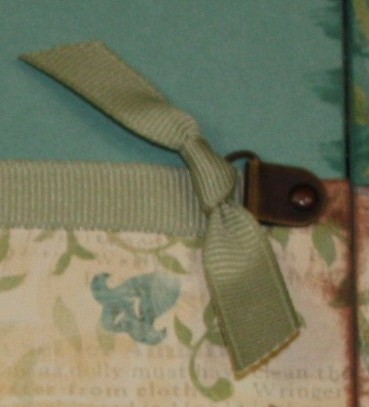
Then she started REALLY decorating! She added a simple zigzag sewing stitch where the Juniper strip met the cream paper in brown thread on both pages. For the other sides of the cream paper, also on both pages, she attached some Garden Green grosgrain ribbon. On the right hand side, she just wrapped around the back and didn't need to worry about the other side as it would be covered with the circles she would add, but on the left side, she created a great illusion. First she attached a photo hanger from the copper mini medley to the inside edge of the paper, letting it extend over the ribbon she had already attached there. Then she attached a simple knot to the ring of the photo hanger making it seem as though the ribbon that stretched across the page was attached to the hanger. Gotta love that clever lady!!!

As to the journaling area, I think that the "Things that make me smile" piece is actually a stickease from the kit. I know the striped paper under it is a designer paper from the Veranda pack. My guess is that she cut some Cocoa cardstock into the frame that is shown using a Cricut machine. She probably also cut the striped paper on a smaller setting, the very same way! On that Stickease piece, she added "glitter" brads and some bitty sparkles - both CTMH embellishments. She also inked up a "Just Blooms" paper flower with a chocolate biggie brad for a center. In the left corner and near the journaling place, she added a decorative corner from the Primavera rub-on collection and several other small rub-ons from the same sheet. To these she added rhinestones, sequins, bitty sparkles, and brads, finishing off the design with the words Family, Love, and Friends also from the rub-on collection, cut from Creme Brulee diamond B&T and edged in chocolate.

She used a rub-on corner on the right hand side as well - this time in the top corner. This one also was decorated with sequins, brads and bitty sparkles. She used the Coluzzle, big circle, to cut out the two circles and distressed them both in Chocolate ink. To the Chocolate one she added another stickease, all decked out in bitty sparkles and even a rub-on flower with a sequin for the dot of the I. To this she added a spiral clip from the Garden Green accent collection, to which she added a knot from Garden Green grosgrain ribbon. Also to this circle, she added a hinge from the copper mini accents set. It's really cool, because if she wanted to, she could use that as a working hinge, hanging through her page protector, to give herself some extra room for journaling, or hiding a picture. She added some more of the "Just Blooms" Creme Brulee' flowers, inked up in chocolate, with biggie chocolate brads as the centers. There aren't as many rub-ons on this page, although still accented with brads and bitty sparkles, but three new words, part of this rub-on sheet, are again cut out of the Creme Brulee diamond paper edged with chocolate ink. She also added a fourth word, overlapping the smaller flower and a little Garden Green spiral clip hanging on the biggie brad in the center.
She is just a master, isn't she?

Truly amazing job!!!

Thursday, May 27, 2010

Veranda Card #4


I loved making this card, but I have to confess that I was inspired by Kym Glass' layout in an earlier blog article. Search "Veranda" to find her layout.
I can also tell you that her layout was inspired by the cover of the Spring 2010 Close to My Heart Idea Book, so I guess, my card was too!
I started with the stamps from the "Treasure Life" stamp set on the Juniper floral B&T card base. I rounded the corners and then inked up the edges in chocolate brown. The circle parts were cut with the coluzzle and the gold one is about 2 "lines" smaller than the brown one. I stamped the sentiment in the center of the gold page and could also use the circle parts as a pocket if I wanted to.

Wednesday, May 19, 2010

Veranda - Card 3


This is almost an monochromatic card, and it turned out so elegant! I started with the back side of the Juniper B&T (background and texture paper) that showes the same design only in shades of Creme Brulee'. I sponged Creme Brulee' ink all around the 4 1/2 x 6 paper and then edged it again by scraping it in Chocolate ink. I did the same thing to the other paper, a Creme Brulee' diamond design paper that measured 4 1/2 x 3. Then, using Creme Brulee' ink, I stamped several images from the Treasures stamp set, using the large, medium, and small dandilions and the stem. I also stamped the center of the dandilion again using a "fluff" stamp from the same set. I stamped the medium dandilion, without the stem, in chocolate in the center of the large image to finish the effect.
That done, I used the rub-ons to add my sentiment at the top and a design at the bottom of the card. Finally, I threaded 2 strings of Chocolate waxy flax through a green button and, spreading out the strings, taped them down on the backside of the card. I didn't want the ugly strings and tape to show, though, so I added a spare piece of cardstock to the inside cover of the card, adhering it with the same 2-sided tape that I used to stick down the strings.

Monday, May 17, 2010

Veranda - Card 2

I LOVE using the Rub ons that Close to My Heart makes. They are so easy! For this card, I used a 6 x 3 inch base from the Juniper floral B&T (background and texture paper). Before I stuck it down, I used an ornate corner decor-punch. I used the punch again on my gold-diamond B&T card that measured 2 1/2 x 2. Finally, I added a 1 x 6 inch piece of the backside of the Juniper B&T as a strap across the card. I sat a little more than a 1/4 inch from the bottom of the card. All of the pieces were inked up in Chocolate by scraping the edges across the ink pad. I used Copper Brads to tack down the strap and added some punched flowers and a button to finish off the design. The "Memories" sentiment was a rub-on as well as the swirls along the strap. Both were from the Love Story Rub-ons by Close to My Heart.

Sunday, May 16, 2010

Veranda Cards


I'm making cards for a class that I have every month at a retirement center. Since I don't open these classes to everyone, I wanted to offer the designs to you. I had a lot of fun making them and especially love the way the Veranda papers work for these designs.
This card is 6 x 3 and I used the back of the floral juniper B&T (background and texture paper) as the base for the card. I used a 6 x 1 1/2 inch strip of the front of the B&T as the paper accent here and anchored it down with brass brads. I tied a Juniper ribbon around it and then set on the daisy accent. For this I used a white "Just Blooms" flower that I inked up in Creme Brulee'. On top of that I added the back side of the diamond paper, the brown side, in a circle and another circle punch with the yellow side showing. On that side I stamped my sentiment - done and super simple!!!

Sunday, May 9, 2010

Veranda Pages by Kym Glass - part 2


As you can see, the partner for the previous page is easily as elaborate as the first. Again I don't know how she sees it. What made her think of bending down the corner of the Juniper print? And why border just the sides of the photo mat leaving the corners open?
Again, I'm in awe. I have no idea where she came up with the ideas but I wish I could catch her fever!!!
She used the same embellishments on this side as on the last - Just Blooms spring collection, Filigree charms, Rub-ons, Sparkles, Bitty Sparkles, and pieces of the Copper mini medley
On this side, she didn't stamp as much, opting instead for the rub-ons - which she fell in love with!

I didn't mention it on the last blog, but I have to point out how Kym makes little lines and dots along the edge of the circle making it look like it has stitching on it. Some of her layouts DO include stitching, but this is faux, yet so evenly marked! And I'm still not sure how she got all the intresting images onto the B&T. Maybe she stamped them in Colonial White? I have to find out about that!
She is also WAY into distressing and swiped all the edges of every paper in either Juniper or Chocolate ink. It gives it such a finished look, don't you think?
Anyway, this is how the two layouts went together. The chocolate paper helps connect the two layouts as well as the use of the circles, and the Juniper and Gold diamond paper.
She is just the master. I'm feeling SO inspired!!!


Friday, May 7, 2010

Veranda Pages by Kym Glass

I have met the Embellishment Queen and her name is Kym Glass. (Yes, I know she's not the ONLY one!) She seems to just visualizes all these great little details she can add. Actually, I don't know how she does it, but I wish she would rub off a little more on me!!!! So this week, I'm sharing art from Kym. She didn't do too many pages at my recent retreat, but those she did were knocked right out of the park! Check out the first one.


She was thoroughly inspired by the Spring Close to My Heart Idea Book cover when she designed this using the Veranda Paper Pack.


She used 8 different stamp sets to create her under design. When you see it up close, you can understand how some of the images were pieced together. And all throughout the images, she added her "bling" - little sparkles and bitty sparkles make a BIG impression at a mere glance!
She cut this pocket with the large Coluzzle circle. It almost looks like she used some sort of reverse stamping or maybe shadowing on that quarter-circle. I'd really like to know how she did that and will have to give her a call!
The flowers are from the Spring Just Blooms set and the "stem" is actually a rub on in Chocolate. She added some filigree charms and more bling to finish the pocket.
For me, that would be beyond enough to call it good and move on, but not with Queen Kym. I have SO much to learn! She found another appropriate place to add some more bling, stamped flowers, distressed Just Blooms, and filigree charms. Some of the charms, she also tinted with some Chocolate ink, but it is easier to do with Stazon ink. She used all the pieces of the Copper Mini Medley - the ribbon slides, and the corner pieces on this page. This page is a perfect one for an album title page, but wait - this page has a partner.
Stay tuned!

Monday, May 3, 2010

Veranda Workshop from April 25 - Layout 4

This double layout is printed in the Veranda brochure. You can still order this kit from me (which includes the brochure), but you need to act fast as I won't be able to get one after the 5th of April. But if you're looking at this and really want to build it, I can get 10 brochures for you and you can pass them around to your buds.

I wanted to show you another example of stamp rolling and masking on this layout, and also another flower image. The image is on the right hand page. It is stamped in Creme Brulee' using the heart-shaped stamp. I made 5 images in a circle with a little overlap to build that flower and then cut it out. After that I sponged the edges with Tulip ink to give them more accent. I put a white fluted "Just Blooms" flower in the center and connected it with a Filigree charm.
The masking and stamp rolling is shown on this little tulip. First I masked most of the ivy, both the top and bottom to get the stem. To mask, you lay down scrap paper to shield an area from your stamping. In this case, I only left the small area that would show the leaf open and the rest of the ivy went on my scraps. I stamped the tulip from the set that comes with this workshop pack in Creme Brulee'. Then I "rolled" the stamp across the pink ink (also called Tulip, but I don't want you to get confused!) from the petals in about half-way. I dabbed that stamp lightly on scrap paper before stamping it on my image, though, so it would be a lighter shade. That's called a 2nd generation stamp.
More on this layout is in the brochure, so drop me a line if you want to get one. You'll also see it again when I get my pictures on it. Maybe at my retreat?

Sunday, May 2, 2010

Veranda Workshop from April 25 - Layout 3


This is a simple layout where I again used 2 different striped sheets so all my stripes could go the same direction. I cut the 1/2 inch strip against the stripe (at the bottom of the right page) from one page and cut the other two pieces, 5 inches and 3 inches from the other page. The other B&T (background and texture) paper with a Juniper print is cut in a 4 inch strip on the far left hand, and two 1 1/2 inch strip - one on the bottom of the right page, and the other cut twice. The first piece is 3 inches long and goes on the stripe on the right page and the second is cut to 5 inches and goes between the right edge and the first mat on the left side. There are also three mats in Juniper, two of which are 4 1/2 x 6 1/2 and the third is 5 1/2 x 6 1/2. I sponged all the pieces in Juniper with a little heavier sponging on the Juniper mats. I also sponged the bases, but in Creme Brulee'.


Before I added any embellishments to this layout, I stamped the covered bases with both ivy and the 4-petal stamp. The 4-petal stamp I used on the right side of the left page in just a half-circle and also in the corner of the bottom mat - both in Creme Brulee'. For the one on the mat, I overlapped 2 of the petals to make it a 6-petal flower quarter in the corner. For the ivy, I started near the bottom of the left hand page and stamped it several times across the corner and onto the right page. When I stamped it, I "masked" some of the stamp so that the head of the ivy wouldn't show over and over. the bottom of the To mask a part of the image, just use a piece of scrap paper and cover the area where you DON'T want the image to show. When you stamp the image, the masked part will be stamped onto the scrap paper instead of your project so just the part that you want will be on your page. I even created a second stem on the left hand page by overlapping and masking the ball at stamp at the same time. On the right side, I stamped the 4-petal flower in a full circle (in Creme Brulee') at the top of the layout and at the bottom with both of the flowers overlapping the mat. I also stamped a half circle on the right side of the mat without overlapping it. On that one and the one at the top, I added a little of the tulip ink (in a 2nd generation stamp) using the stamp rolling method.

I layered a couple of different flowers from the Just Blooms spring collection onto each other and the stamped images to finish off the look, even sponging some of the petal tips in Tulip and sponging the centers the same way. Those flowers that hung off the edge of the page or the mat, I just cut to give it more depth and a different perspective.

The top center flower earned my largest Filigree Charm and I used a couple of others on the other side to give it a partner. I also lightly sponged the raised edges of the white butterfly in Creme Brulee' to give it depth before I applied Tulip to the outside edges of it. I didn't have any more brads or centers, so I just used the butterfly to cover the flower center so it wasn't so obviously bare. There is one other flower on the other side that will be easier to explain with a close up picture and I'll do that when I share the fourth and final layout.

Friday, April 30, 2010

Veranda Workshop from April 25 - Layout 2

This layout, like the last one, is from the Imagine book. I would love to give you the page number as I followed this one pretty closely, but, alas, I have misplaced it. Hopefully I'll uncover it as I pack for my retreat this weekend, but in case I don't, I can still give you some of the pointers.


First, I started with Chocolate Card Stock as my bases. I used the great ivy stamp from the set that came with the workshop in Chocolate ink to make the pattern on the bases. When I did the stamping, I rotated the ivy image and sometimes even overlapped it to give the base a wall paper type of effect.


Something else I did with this layout is use both pieces of striped paper that came with the set. I used one of the papers to cut the pieces that went across the stripes, and I used the other paper to cut the pieces that went WITH the stripe. So the piece on the far left is a 2 inch cut going with the stripe and the piece on top is also 2 inches wide (by 7 inches) going across the stripes.


On the right hand page, top piece is a 2-inch cut across the stripes and the bottom piece (also going across the stripes) is only 1-inch wide. The Juniper print is 3 inches wide on both pages, and the Parchment Cardstock mats measure 5 x 7.


All the paper pieces are sponged with Juniper ink except the Chocolate card stock bases. I used 2 photo clips from the Copper Mini-Medly metal embellisments on either side of the design. I also added flowers and started by stamping the vine image at the top of the left-hand base. I love the Just Blooms sets and for this design, I used the spring collection. I stacked a large white mult-petal disc (after I sponged the edges in Creme Brulee' ink) under a Creme Brulee' fluted flower, which went under a white, 8-petal flower with Creme Brulee sponged on the edge. I held it all together with a copper brad. My second flower stack started with a large, Creme Brulee', 8-petal flower (with the edges sponged in Creme Brulee' to darken it) and was topped with a smaller flower of the same type, all held together with a Filigree charm. I finished off the right side with a Tulip-colored butterfly, the middle of which I dabbed in Chocolate ink. The flower collection on the left hand side was achieved some of the same way, except without the ivy stamped onto the base.

Wednesday, April 28, 2010

Veranda Workshop from April 25th - Layout 1

I love doing these layouts and I always have pages ready for my pictures. My next one is May 23 and we'll be using the new Splendor set. Let me know if you want to join us!

The Veranda papers are so beautiful and I can't wait to add my pictures to these! This particular design started from a layout from the Imagine book. However, the one there had so many layers that the base paper (the colorful floral) is almost totally covered - what a waste! So what I ended up with is terribly easy! First, I used the green ivy papers - 2 come in the package - and cut an 8 1/2 inch square for the left-hand side and two 4 x 7 inch pieces on the right-hand side. I also cut a 1 1/2 x 12 inch strip and another 3 inch piece that is 1 1/2 inches wide from one of the green ivy sheets. Those I used upside down as accents for the page. I completed it with a third 4 x 7 piece and two 3 x 3 pieces from the Juniper cardstock.


Because the paper is so busy, there isn't any real need for a lot of embellishments, so I kept them to a minimum. I started off using a medium tulip multi-petal circle flower from the Just Blooms paper flowers spring collection. On top of that I glued down a daisy I made from the stamp set that came with the Veranda kit. It's so cool that the Scrap-booking packages comes with a stamp set that is made especially to go with the paper designs. This stamp is a four-petal one that you will stamp over and over in a circle. It also includes the dot that makes the center circle.


As a last embellishment, I used the small bird from the included stamp set. This I set into the "frame" that is part of the Copper Mini-Medley Collection.


For both the flower and the bird, I used a technique called "stamp rolling". I originally stamped the artwork in Creme Brulee', a light tan color. Then I "rolled" the stamp onto the Tulip stamp pad from the edge in, pinking just the tail and wing edges on the bird and just the tips of the flower petals. Then I can line up the image and stamp directly over the artwork again, adding the color to the original set up. Try it first on some scratch paper to make sure it is the combination you want. For mine, I ended up dabbing the pink on my scratch paper before I restamped it to lighten the ink a little. That is a second technique called "2nd Generation" stamping. I also stamped the large bird in the corner opposite the flower using the same colors and techniques.

Friday, February 19, 2010

Envelope Album using Veranda


This is a super-easy project that I did with some folks at a Retirement Center. First I prepped it by attaching 4 envelopes to each other. The first two I attached on the flap with one flap perfectly overlapping the other. Once they were attached by the flap, I stuck down both flaps to the INSIDE of the envelope. Once those two were done, I just attached two others (one to either side) also by the flaps so that the whole set of four folded up like an accordion.
The first picture shows the cover of the album. I'm not sure what pictures I'll use in it, so I haven't created the title yet. I used background and texture paper (B&T) from the "Veranda" pack to decorate my envelopes. My cover is the one that folds up to show the front side of the envelope - where you would write the address. The floral sheet measures 4 3/8 x 5 11/16. I know those are crazy measurements. It might be just easier to adhere a 5 x 6 rectangle and trim it to the envelope. The brown paper measured 5 x 4 before it was torn. The gold paper is the back of the floral (don't you love 2-sided paper!) and it measures 4 x 2 1/2. I edged both the floral and the gold in gold ink, but it works just as well to be edged in Creme Brulee' ink. Three buttons finish off my cover, but the decorative pewter brads are awesome with this palette.
This is the INSIDE of the accordion, with the diagonal pocket being the inside of the cover, but it doesn't really matter how the pages are organized, so long as the pocket pages fall where the envelope openings fall.
The first envelope opening has been cut along the diagonal to form a triangle. Make sure you cut the TOP of the pocket! I covered that with the back side of the gold diamond paper and just trimmed it to match the rest of the envelope lines. I distressed the envelope with Cocoa ink and added a garden green card (4 x 5), also distressed in Cocoa ink, to the pocket. I figure I can add a small picture to the triangle and another one to the card inside.
The second page is simply another floral sheet to serve as a matte, measureing 4 3/8 x 5 11/16, also distressed with Cocoa ink. The third page I used floral again with a tiny circular chunk cut out of one side. This sheet measures 4 1/4 x 5 1/2 and I edged the showing envelope on all sides in Creme Brulee' ink. A Cocoa card measuring 4 x 5 is tucked into the envelope.
The final sheet on this page starts with the gold diamond piece at the top, measuring 2 1/2 x 4 3/8, and distressed in Cocoa ink. Under that is the backside of the same paper measuring 3 x 4 3/8. At the bottom is a strip of garden green cardstock measuring 1/2 x 4 3/8 that is also sponged with Cocoa ink. I intend to put just one picture on this but I could put two cropped ones.
This last picture shows the "back" of the album. The cover is the far-right piece. The one next to it, like the inside of the front cover, is cut along the diagonal of the envelope. Again, make sure you cut the TOP of the envelope. I used a full sheet of the gold diamond (4 3/8 x 5 11/16) with the gold on the inside and only put adhesive in an "L" shape along the bottom and left side of the gold side of the paper. Once that was attached, I put a little more adhesive on the brown side of the rectangle and pulled the corner down to make another pocket. I didn't do any ink distressing here, but added a green tag measuring 3 x 5. It's easy to cut a simple tag shape. Just put the outside corners together and trim across them both at the same time. It makes a mirror-cut without making a fold mark.
The next page is just a gold diamond paper measuring 4 1/4 x 5 1/2. I distressed it with both Cocoa and Garden Green ink. The final page is exactly like one on the inside. The floral again measures 4 1/4 x 5 1/2 and has a curved chunk cut out of it. I didn't mention it above, but add adhesive on only a horseshoe around the paper, leaving the cut side open for the pocket. Again, I inked up the showing sides of the envelope in Creme Brulee' and added a Cocoa card measuring 4 x 5.
Let me know if you make one of these! They are super simple and I'd love to see your take on it!


Friday, January 29, 2010

Variations on a Theme!

I totally failed to mention something important in the last post. The background and texture paper (also known as B&Ts and design paper) that Close to My Heart makes are 2-sided. The main side has full color artwork on it and the back side has the same design in a coordinating monochromatic color. It's hard to see in this picture, but the brown paper has dots of all sorts of colors in it. The back of that paper is cream-colored with light dots on it and is seen in the light flourish on the right hand page and the curvy strip on the left-hand page.

This is Sherry's design. She's added some green ribbon to make extra strips on her page.


Sherry's layout and Julie's - seen here - are the only ones that showed the circle cut in half. Julie even cut the ring and I love the effect it made! I also like how Julie's strips seem to flow across the whole layout.


Okay, Brandy's gonna get me for showing her closed eyes in this picture, and I truly plan to edit it if I get the chance, but I really wanted to show her take on this. Just like Julie, she let her strips flow and connect. She also distressed her base pages in the same colors as the Veranda paper pack. I love the way it brought unity to her page! Brandy is an embellishment queen - I can't wait to find out how she finished this layout up!

Alissa also kept the flow of the strips between the pages. She, like Sherry, made use of the two sides of the paper. I hadn't thought of that!


Below is Ashley's art. I love how she alternated her mattes between straight and crooked.
You know, if I used all the things I liked from everyone's designs, I'd probably end up hating the layout because it would be too much. But each one is so unique with its variations of the theme that they all stand out!


Tuesday, January 26, 2010

Retreat Workshop

Yes! I do some type of workshop for every retreat. We've made clip boards, tag books, and layouts - lots of layouts! This one is my all-time favorites. I needed inspiration, just had no idea what I wanted to do for this page. So I started looking through websites. I mainly used scrapbook.com and scrapjazz.com. I found all sorts of layouts, and although none of them were like my final product, I used bits and pieces from several of them and inspiration from MANY of them! All that is to say, if you feel like you're running dry of ideas, review the layout posts here and visit some of the sites I mentioned. You're bound to be inspired in no time!

Above you'll see the layout that was closest to what I made originally. This is Chelsea's creation, but it is a lot like mine - which I DIDN'T take a picture of, go figure! When I taught this, I showed my layout and explained some of the techniques I used, then I simply passed out all of the elements. I had cut everything, both free-hand and using my Cricut. I used the Veranda paper and made a large ring with my Cricut. I used the ring on the left and cut the center of the ring in half (well, slightly off-center) and used it on the right page to sort of frame the photo at the top. I cut the 3 straight strips and the mattes on my personal trimmer and free-handed the curvy strips. The flourishes were also cut on my Cricut - yes, I had a blast!

The only real trick with this layout involved the ring and the picture beside it. Once I matted the picture, I adhered the whole thing to the ring and then trimmed what was hanging over on the inside. It wasn't very hard, and, since it was covered by the ring, it didn't have to look pretty. While Chelsea followed my design, she added the ribbon at the top of the right page (LOVE that idea!) and the elegant scripted words to it. She also used cocoa ink and an edge distresser (also known as scissor-distressing) on the edges of her mattes and strips.

I have to say, this was one of my most FAVORITE layouts! I will use it again! Watch for the next post, where I'll show you what some of my other retreaters did with the elements. It's amazing! No two layouts were alike.