.

Showing posts with label Workshop on the Go. Show all posts

Tuesday, March 1, 2011

Sweetheart Workshop - Layout #2

Like I mentioned in yesterday's post, these layouts were fast and easy. I think the reason they were so fast is because the papers - the B&Ts (background and texture, also known as printed or designed paper) - are so GREAT! In this one, the paper I dubbed "Heart Lattice" provides the base. I wanted to show plenty of it, so, while a Magic patter inspired the layout, I altered it quite a bit!

The best thing about this layout is how the papers stretch across both pages. The effect makes it flow together perfectly. The pink cardstock (our new Cotton Candy color!) is cut 10 x 8 for the left and 6 x 8 for the right. Under that is the floral B&T. A 10 x 2 strip peaks out at the top and bottom of the cardstock on the left, but the 10 x 11 piece dominates the right hand page. A 3 x 12 piece of the strip goes along the bottom of the grouping, about 1 1/2 inches from the bottom edge of the base, and over the floral paper. Last, but not least, I highlighted the bottom of the pink cardstock with just an edge of white cardstock and a second layer of black cardstock with a scalloped edge on it.
I really liked the effect the edging had. It makes the photo section sort of pop out. I added a couple of butterflies to the top-left corner of the page and a little heart epoxy sticker to the bottom left corner. Both the stickers and the stamp set comes with the workshop kit!
I also added another epoxy sticker to the right side of the layout that looks a little like a backward S. This is to highlight my title when I get it on. The title will be "And They Call It Puppy Love," and this time it will be in white. I'll likely use my Cricut for it; at least for the "Puppy Love" part, because I intend to put that over the striped section at the bottom of the right hand page. The other epoxy sticker, that looks like a regular S, marks the end of where I expect my title to go.


On that right hand page, I added a heart sticker and adhered a stamped heart directly on my picture. Our stickers, adhesive, paper, and inks are acid free and lignon free so they are safe to use even directly on a picture!
Something else I like to do when I can is spread one picture across both pages like with this pic of my son with his new puppy. (I can't believe he was ever that tiny - the puppy, not the boy!) It really draws the eye into the pages and makes them work together like a team.

Monday, February 28, 2011

Sweetheart Workshop - Layout #1

Our monthly workshop lasted only about 3 hours last night! These layouts proved to be the EASIEST we've done in QUITE some time, but they turned out AWESOME! Since I have 4 kids, I keep 5 albums - 1 for each of them and 1 for myself. That's the reason for all the duplicate pictures over the next few days. I plan to title all of them, "And They Call It Puppy Love!" (Yes, I was always a Donny Osmond fan!) The title on this one will go across the top, Tulip cardstock and I'll use black paper or ink for it.
The Tulip cardstock is actually the base here. I used three 1 1/2 inch strips of black cardstock as borders between the top half and bottom half of the page, but on the left hand page, you can tell that I cut the border into "chunks" so that one of them overlapped the picture a little. It turned out that I only used a 1 1/2 x 4 overlapping the picture and a 1 1/2 x 3 to complete the border on the other side. I edge the horizontal borders on both pages with a 1/2 inch strip of the floral B&T, but again, I chunked that up to match the black cardstock on the left hand page. Also on the left hand page, I added a 1-inch strip of the floral next to the vertical black, going under the horizontal stripe. As final accents on this page, I used the Sweetheart Assortment of epoxy stickers that comes with the workshopt set. I added a 3 dots to the horizontal stripe and a frame to the bottom corner. The workshop set also includes an exclusive stamp set, made just for the workshop. This one had some great ones in it. I stamped one of the butterflies, using the rock-n-roll method to deepen the color at the edge of the wings, and cut it out to add to my frame. I thought about titling the page "Dog and Butterfly" (yes I'm a child of the 80's) but I decided I better not because Captain, the black puppy in the picture, would just LOVE to eat the butterflies - a gruesome thought - totally away from the spirit of the song that inspires the title!

The right hand page was super simple! The heart paper is just a 6 x 6 square (the 3 x 6 on the left hand pages just gives an illusion of a larger frame.) Then the black accent along with the floral strip finishes off the page. There aren't even many accents on her. I added 1 epoxy heart, with a cut-out stamped heart and a directly stamped heart up by Captain's picture (He was about 2 months old when he came in the pic where he's licking my boy and he was 4 months in the next picture - so handsome!) and 2 little dots on the floral strip like the 3 on the left hand page. Simple and done - that's the way I like the workshops to be!


Monday, January 10, 2011

Magnifique Workshop #1

Before I go any further, let me make a plug for the Wings workshop kit. Even though my workshop may be full, this kit is SO worth it and you can make several different things without any help from me! All of the workshops include a main double layout, a suggestion for a 2nd layout and a card set to choose from, but the wings workshop also includes a great banner pattern to create with the leftovers after you make the main workshop pages. It is an AWESOME kit! You can see a flyer for it HERE.
My workshop was full yesterday and we had a great, creative time! This one was actually the December workshop, but since the end of December was so busy, we kicked it into the first part of January. I have a workshop at the end of January, too. It MAY have 1 seat open, so if you're interested in it, give me a call.


The layout shown in this post is the one that was explained in the brochure that came with the Magnifique kit. The kit is still available for the month of January, but come February when the new Idea Book goes live, this kit will be gone.

The beauty of these kits is that they come with an original double layout design and full-color instructions to recreate it. They also come with embellishments and a stamp set made especially for the kit. The Magnifique set comes with a floral designed stamp set and the Shades of Chocolate Mini-medley embellishment set. We no longer sell the embellishment set, and the stamp set can't be purchased separately. Add to that the fact that you get the set at a discounted price from what it would be if you COULD buy it all separately and it is a great deal at $29.95 plus shipping and tax. Another prize is that I show all the layouts that I include with my workshop, so even if you miss it, you can recreate it all on your own.

All this is to say, you need to order the kit now or lose the chance. However, the paper pack will still be available through July.

The embellishments on this particular layout were so much fun to make and so easy! All of them are laid out step-by-step in the brochure that comes with the workshop kit, but basically I stamped the flower images in Pacifica ink in full strength (1st generation stamping) and also in 2nd generation stamping (stamping a second time, after some of the ink has been removed on scratch paper). With this technique, I also interspersed paper flowers, brads and "Biggie" brads (all part of this kit) along with dots of various colors. The effect was fanciful!


Wednesday, December 1, 2010

Passages - Layout #5


These two layouts were part of a challenge from one of my customers. See once we're done with the workshop, she pulls out some extra cardstock and uses the scraps to make some extra layouts. (Yes, she's very creative!) So I wanted to use more of the paper so she wouldn't have to come up with design ideas herself. And voila! These layouts came out.
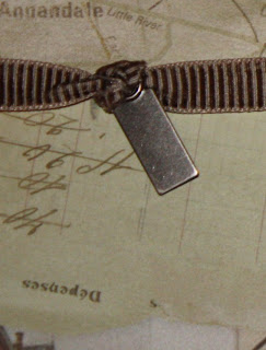
I started with a 6x10 of the map paper on the left-hand page and a 2x6 of the postcard paper along the bottom of it. Then I used a 6x12 piece of the stripe (cut with the strip, vertically) for the other side of the paper. On the edge of this, I put a 1x10 of the postcard paper, leaving 2 inches of the stripe at the top showing. I then cut a 5x2 piece of the postcard paper that lines up in the center of the layout, flush with the edge of the map paper. A 13-inch ribbon with a pewter slide stretches across the page at the bottom of the 2-inch section. The other ribbon is described in depth below.
The right page starts with 2x12 strips of map paper, brown cardstock, and stripe, all lined up next to each other. A 6x6 pocket of the brown B&T makes up the bottom right of the layout. For the top right, I used a 6x6 piece of map paper and a 5x5 postcard cut as a mat on top of it.
I used more of the brown B&T as a tag in the pocket and added a pewter hinge at the top to keep it from falling into the pocket. The general measurement of the tag is 3 x 5. A ribbon is stretched from top to bottom of this layout and a 1x3 piece of postcard adorns the top of the pocket.


The ribbon at the bottom of the left-hand page is knotted on the right side and the resulting loop is slipped over the side of a spiral clip. That clip is then attached to the layout with a brad, like on other pages. I tied another knot around a photo clip and then wrapped the end of the ribbon around the left side of the layout to complete the design.
All-in-all, I was really pleased with this workshop. I used almost all of the paper in the set and ALL of pewter embellishments along with most of the ribbon. I was really pleased with the results of the effort.

Tuesday, November 30, 2010

Passages - Layout #4


These easy layout were included with the Passage Workshop on the Go kit. I try really hard to make them just like they are shown, but this one begged a change. See the little circle designs are actually four folded circles, like this one.

To make it this way, you fold it in half and then in 1/4 before unfolding it. Then you collapse it so that the two sides fold into the center of two triangular quarters. Then with your thumb, you fold down one top edge of the quarter. It's easier to see the design when using paper that has more of a difference between the back and front. You put 4 of them together to make the complete circle and then put a brad in the center.


I made a much easier version, though, and it only used 2 circles instead of 4. For this one, I used one circle as a base and then folded just a bit of the second circle to make it more of a square. I then put a brad into the center. It doesn't have the folds or bulk of the original, but it is much easier to make and work with.

The top accents are easy with the new Chocolate Ribbon collection. I just anchored one end with a pewter hinge around one edge and wrapped the other end around the other edge of the page. Adding some quick stamps and decorative brads made an easy and fast double layout.

Monday, November 29, 2010

Passages - Layout #3


The designs on these two pages left too much base page showing and I didn't like the effect, so I altered the design to completely cover the bases. The cuts on the left-hand side start with a 1x12 strip of the journaling sheet. The catch with this cut is that it goes across the words so that they will show vertically on the page. All the other cuts are horizontal, with the writing lines. There is a 2x4 cut like that at the bottom right corner of that page. Next to the 1x12 strip of journaling paper is a 1x12 strip of postcard paper. Another postcard cut is a 4x4 at the top right corner. The last base-cover cut is a 6x12, with the lines, on the striped paper. A 5x7 and 4x6 of Brown Bag cardstock finish the collection. The 5x7 sheet is edge-distressed all the way around and the 4x6 has the top edge torn off, just a bit.
On the right-hand page, the top is a 4x12 of the postcard paper. The bottom is a 2x12 of the journaling paper - cut horizontally, with the writing. In the middle of this is a 6x12 of the striped paper, but this time it is cut ACROSS the stripes. That way the stripes will agree between the pages.

The decoration at the top of the left-hand page is worked with a few different cuts. The base is a 1x7 inch scrap of any B&T (I used some postcard paper). On top of that is a 1x12 inch brown B&T paper. I left 1 1/2 inch flat and then made a crease. After a 1/4 inch, I made another crease, then again after 3/4 inches. I continued down the paper, creasing at 1/4 then 3/4 inches until I was left with 1 1/2 inches at the end. On the two ends, I added an open hinge to one and a stamped key hole (stamped in Colonial White) to the other.

At the bottom of the pages, I added a 1-inch strip of Brown Bag, both of them 5-inches long, but torn to differen lengths. On the left-hand page, I embellished with brads and spirals. On the right hand page, I repeated the pleated brown B&T design paper and tucked on end under the torn cardstock and the other one under a pewter photo clip.


The final design, at the top of the right page, started with an upside down 1x8 strip of postcard paper. Along with that, I cut a brown ring out of scrap paper, measuring about 3 inches, and another about 3 1/2 inch circle out of Brown Bag. Both of these I edge distressed, like all the other cardstock pieces. At that point, I folded 1 inch of the postcard strip and secured it with a pewter designer brad and then glued the left edge of the ring to the circle so it would be centered on the Brown Bag circle. Using the entire unit, I stretched the postcard paper to the right edge of the layout and glued it down, flush. Then I glued down the rest of the unit as it layed evenly across the page.

Saturday, November 27, 2010

Passages - Layout #2


Not sure why the colors on these pics are different, but be assured they are both from the same paper pack and really do go together. This layout started the postcard paper from the Passages set. It seemed a perfect partner to the journaling paper in the set, so I put them together and mounted on the chocolate cardstock. The open spaces on this layout was key, because the base paper complimented the others perfectly.

The cuts for the left-hand page included a 2x5 and 2x7 of the journaling paper. From the postcard paper, a 5x5 and a 5x7. From the brown B&T I cut 1 1/2 inch squares (3) and punched some circles to go in the squares from the Autumn Terra Cotta cardstock.

The cuts for the right-hand page include, from the journaling paper, two 2x7 strips and a 5x5 and 5x7 from the postcard paper. Again, 3 squares at 2x2 each from the brown B&T and punched circles from the Autumn Terra Cotta cardstock complete the cuts.

On both pages, ribbon from the chocolate collection is used. For the left-hand side, I used an 8-inch piece of ribbon. I tied one end of the ribbon around a metal tag then gathered up the other end tightly until the ribbon was only about 3 inches long from knot to tip. I glued it down with adhesive (usually Liquid Glass - I LOVE Liquid Glass!) letting the knot and tag hang down and I wrapped the other end of the ribbon to the bag and secured it the same way.

On the right-hand side, I used a 14-inch piece of ribbon. I pulled the white strings a little out of one end of the ribbon and tied the strings in a knot, then out of the other end of the ribbon, I gathered up the ribbon tightly until it was 8 inches long. Before I put down the bottom-left postcard paper piece, I glued down the ribbon, putting the knotted end around on the right side of the layout. The other edge of the ribbon tucks under the postcard paper piece about a half inch. I make sure that the gathered section isn't under the postcard paper.


The circle punch that I have has an edge to it, and it is about 1-inch in diameter. I decorated them with spirals, medium brads, and designer brads from the pewter collection.

I lined up 3, vertically, on the right-hand page and the other 3, horizontally, on the left page so that, when placed together, they look like a continuous design.


I know a LOT of people travel - and this set is perfect for photos from those trips, especially European trips. For me, my best trip is to my in-laws in Oklahoma (a peaceful, but not normally chic, destination) so I'm not really sure how I will use these layouts. If you have any ideas, pass them along!

Monday, September 20, 2010

Passages Workshop #1

I'm terribly delayed in posting this workshop! Life and volleyball season has set in!
This is a wonderfully easy layout that I based on the orange and red printed B&T that came with this set. This left page has a 4 x 12 piece of the smokey B&T along the left edge, and a 4 x 8 piece of Chocolate cardstock across the bottom span, about 1 inch from the bottom edge. In the top section, a 6 x 7 inch piece of brown bag cardstock is layered with a 6 3/4 x 4 1/2 piece of chocolate cardstoco as a mat for a focal picture.
I embellished this side with some satin ribbon. I cut it to 15 inches and then cut it in the middle and retied it for extra flair. I also added 3 brads and one picture clip to the focal point mat.

On the right hand page, also based on the orange and red B&T, I put a 6 x 6 smokey B&T in the bottom right corner and a 6 x 6 piece of Brown
Bag cardstock in the bottom left corner.
I put a 3 x 6 piece of the smokey B&T (turned to the back) in the top/left corner for a journaling section and
I'm embellished it with a hinge attached to the top section. I added a chocolate cardstock mat (7 x 5) embellished with a stamped clock face from
the included stampset (in Chocolate) on some scrap paper and cut out. The scrap paper I used was a bit of the postcard B&T I had left over and just happened to have a light impression of the capitol building on it. I added another satin ribbon done the same way to this page.

Friday, July 2, 2010

Cherry-o Workshop Layout #4

My FAVORITE of all of the layouts!!! I can't give out all the instructions for this one, but never fear! This is the layout that is included in the full color brochure that comes with the Cherry-o workshop! And it is just plum FULL of techniques and extras!!!

The stamp set that comes with the workshop has some great images including the little checker-board down at the lower right of the page. This looks really cool as you're looking and actually resembles a zigzag stitch. Also, the "Sweet" in the "Sweet Smile" sentiment stamp fits perfectly in the little photo tag embellishment in the Tulip Mini-Medley.
In addition to the other embellishments (shown on the flyer HERE) I added the new Cherry-o Opaques. They add a little textured bling to the pages and the two little beaded cherries on this page are examples. I had some workshop gals worried that they had to place each little bead to make the image, but it isn't necessary. They are actually on transparency film that is already covered with adhesive. One more detail here is the large button. The chocolate waxy flax was just too thin (to me) for the large button so I doubled it and tied it in a square knot along the other side.

More of the cute stamps are shown on this side of the layout along with another cool technique. The blue border is the back side of the striped B&T. The scalloped border is created with the Close to My Heart corner rounder. You slip off the corner guide (yes, it just slips right off) and, looking at the opening on the bottom of the corner rounder you line up the edge of the page with the outside metal edges of the corner guide and press. That should make one smooth cut into the edge of the paper. Repeat it, but line it up so that the near cut you just made overlaps the cut you are about to make. As you continue, you'll see the design appear. Trim any rough edges with your scissors.

"Second Generation" stamping was another technique suggested in this layout, but if I had it to do all over again, I would probably do it with the full ink. It is just a little too light to see clearly. Another change I made when I taught this layout (although it doesn't show here) is that we made this little art card a 2 1/2 x 2 1/2. That little change gave enough room for my workshop gals to add all of the leftover brads they had instead of just the 3 that are called for in the brochure.

Also, when you put buttons on a layout, use glue dots or Liquid Glass. Our Mono Adhesive is awesome, but it isn't enough to hold buttons onto the layout consistently.
I love how they go together. I'm thinking seriously of using a 5 x 7 photo for the center and cutting it in half. I really like to do this because it connects the two pages together.


Thursday, July 1, 2010

Cherry-o Workshop Layout #3

This layout is going to be perfect for the Easter pictures I have from this spring! The Sweet Leaf card stock acts as a base for these pages and the striped B&T, cut to 8 x 12 is the bottom section of this page. I plan to crop some regular pictures just a little smaller than the typical 4 x 6 in order to fit 4 evenly across the bottom section of this page. The top part will be the Title area and I'll add another small picture on the right, under the photo clip. (By the way, the photo clip comes with this workshop set in the mini-medley pack and I've tied a little knot of Chocolate Waxy Flax around the thinnest part of the clip.) On the left side, I added 2 of the Cherry-o Opaques to bring a little bling in.
I actually used parts of both of the striped paper for these layouts, and the second page requires a 6 x 12 piece cut "with" the stripe to match the direction on the first page. That piece goes against the right side of the page and has a chocolate 1/2-inch strip bordering it. About 2 inches up from the lower edge, I adhered a 4 x 4 chocolate mat for a small picture. I plan to put a full 4 x 6 photo near the top right of the page and will probably go ahead and mat it in chocolate.
About 1/2 inch from the left side, I have a 3 x 12 inch chocolate piece that I might use as a journal section, but more than likely will put a thin picture near the bottom of the card. A 1 x 3 inch strip of the stripe goes 1/2 down from the top of the chocolate card as an accent. In keeping with the accent on the other page, a photo clip adorns the top left corner of the card, again with a knot of Chocolate Waxy Flax at the thinnest spot. I also stamped the sentiment from the matching stamp set along the side of the card in Tulip ink.
As a final accent, I added a partial circle of brads in the bottom right corner, with a designer brad in the center. I did something like this on the other page, but the picture cuts it off. In any case, it doesn't show up as well because it happens to fall on the polka dot stripe of the B&T. I didn't add that step to my workshop and instead added more "cherries" to the 4th layout - but you have to wait until Thursday to see that one!


Wednesday, June 30, 2010

Cherry-o Workshop Layout #2

I think I'll end up liking this layout more when I get the pictures on it. I love the paper, just a 3 x 12 strip of the cherry B&T at the top, but my embellishments just don't show up very well. I plan to use vellum paper, though, (the whitish, translucent paper) for the title bands on both pages, held down by the biggie brads that really are up in the corners of the cherry paper but are camouflaged by the print of the B&T.

The red print is the base of this page and I have started using the design paper (Close to My Heart's background and texture paper) as base pages more often. This page is accented with a simple cherry stamp design where I tied a piece of chocolate Waxy Flax around one of the stems. A large button, again with a Colonial White designer brad, completes the grouping at the bottom left of the page. I have some extra paper left over from this kit that I will use for photo mats.


On the second page, I used a 4 x 12 across the top, lined with a 9 x 1/2 inch card stock strip. (Incidentally, the strip will be up against a 3 inch photo.) I cut a 3 x 4 inch chocolate tag with rounded corners for a photo or journal pocket. The front of the pocket was made with a 3 x 3 square of the cherry B&T. I cut a notch out of the center-top of the square, after I rounded the corners, using the edge of a circle punch. I also made a circle punched out of the chocolate cardstock, folded over on itself for the top center of the tag. The rest of the tulip ribbon attaches this tag to the layout (CHEAT ALERT! I actually adhered, lightly, the tag to the page so it would stay in one place!) and another metel tag from the mini medley set hangs in front of the tag. The brown journaling spot near the bottom measures 3 x 5 and has the right corners rounded. Held down by the biggie brads, I plan to added my journaling to a piece of vellum attached to the card.
As a final embellishment, I added another Cherry-o Opaque to the bottom-right of the layout.