.

Showing posts with label Wings. Show all posts

Monday, February 7, 2011

Brochure Layout - an Editorial


I know I usually explain how I made or embellished the layouts from the workshops that I've completed, but this time I'm doing something a little different. See, I can't really explain this particular layout in much detail anyway because it is the layout from the full color instructional brochure that came with the workshop kit.
So I'm gonna give a little editorial on the sentiment that is shown here. First, I gotta tell you, I loved the instruction's technique of masking the sentiment card with the actual stamp. It turned out so cool! But, I totally disagree with the sentiment. I could go through some clever stuff about the mind of Picasso, but I don't really want to hammer the poor, sad man. Instead, I'd rather redirect to the truth. Everything you can imagine ISN'T REAL; that's why it's called an imagination! BUT, there is something real about our imagination and this sentiment reminds me of it. Ephesians 3:20 indicates that God "is able to do exceeding abundantly beyond all that we ask or imagine . . ." How amazing is that. Everything that I imagine isn't real! Thank GOD (and I SURE don't say that lightly! Is there ANYONE who would want EVERYTHING they could imagine to be real? Talk about a Midas curse! No mom would, that's for sure!!!) But my heavenly Daddy (Jesus said in Mark 14:36 that we should call him, "Abba" which means "Daddy.") is able to do more than I can imagine. "Exceeding Abundantly" so much more that I can't even comprehend it. That is just way cool. The sentiment on this page is already gone!
A couple of details on the embellishments, though. First, I used a second generation stamp on all of the floral images, in Vineyard Berry. Then I did a "rock-n-roll" technique in full Vineyard Berry along the edges. I added a small, black brad into the center of all the floral images after I cut them out.
On the photo frame, I put one of the floral images. Then I threaded 2 ends of the ribbon into the center hole of the photo frame and tied the ends into a knot to hold it in place. I have to say that I think it 
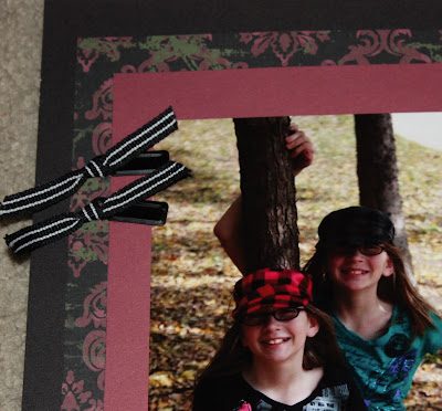
would've been a lot easier to glue the photo frame to the ribbon and then glue the knot to the top of the photo frame. It gives the same effect, but isn't nearly as difficult.

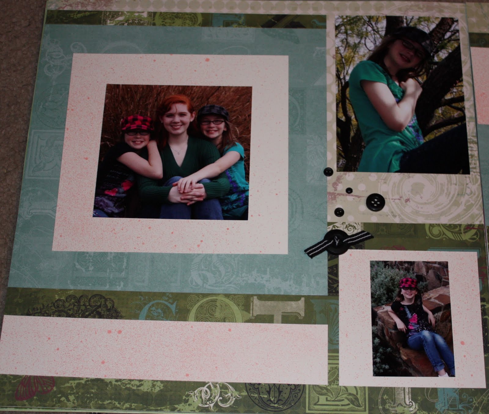
Two of the photo clips (also a part of the black Mini-Medley that came with this workshop set) were used on one of the pictures. Three inches of ribbon were knotted on each of the photo clip before they were attached to the layout. Liquid Glass or Glue-dots are the best ways to attach metal accents.

The long, swirly stamp was use to adorn the Sweet Leaf 1 1/2 inch strip, but there is a trick to attaching a previously stamped image to the next image. I used the stamp right-side up for the first image and then up-side down for the next image, repeating the pattern. I also made a point to create a double loop (like two paisleys in a circle) each time I stamped the next image. As a final trick, I started stamping the first image in the dead center of the strip and added images to either side of the center until I had filled the strip.

This workshop was a BLAST to put together! I hope you will share yours with me if you try it!


Friday, February 4, 2011

Wings Workshop Layout #4


This layout utilized the decorative backsides of our Background and Texture papers. The design is from page 98 in Magic and is called, "Abracadabra."

For the bases on this double, I used the light colored, dotted B&T paper that came with the Wings workshop kit. (BTW, the Wings workshop kit is available still!)


I liked the way this page came together, especially the way the Juniper (bluish) color was highlighted. It totally changes the look of the set. On the original layout, the top-right open spot was saved for journaling and decorations, but I preferred to use it for a photo. (I'm all about using the space on pages for photos. With 4 kids, I really need to utilize the space as efficiently as possible!) Under the main picture, I intended to add another picture, but didn't need to, so it will be my spot for the title, "There Were Never Such Devoted Sisters!"

Just like on the last few layouts (especially layout #1) I used the new spray pen with Vineyard Berry ink to create a texture on the Colonial White cardstock. The trouble with this layout is that I left two really important (and rather large) elements out of my patterns. So when I got to the end of all of my cutting, and had used the last of my papers for the most part, I realized that the large 8 x 8 square hadn't been cut and neither had the 3 1/2 x 8 piece on the right-hand page. The only paper I had left was the letter-filled B&T, but it was already being used on this page, so I got creative and used the back of the letter-filled B&T for the last two pieces. I'm SO GLAD Close to My Heart started putting designs on the backsides of our texture paper!

I also enjoyed the embellishments for this page. I randomly stamped one of the floral images several times on the 1 1/2 x 12 Colonial White strip. I also stamped the mini heart just a few times between the images and finished the strip out with 2 small brads that were part of the "Mini-Medley" that came with the kit.


On the left-side of the page, in the journaling place where I put a picture, I also added several accents. I knotted some ribbon and glued it to the top of the button, then glued the button to the top-left of the small square in the bottom-right of the left-hand page. I scattered 2 small button brads, a small 4-hole button, and a small brad between the button and the picture.

I was so pleased with the way this turned out. Let me know if you try it!

Thursday, February 3, 2011

Wings Workshop Layout #3

Now I admit, this is not a favorite layout. I really thought I would like it, and I still may, but I have to do a little work on it before I get to that point.
I used the beautiful green floral B&T paper as one of the bases and I used Sweet Leaf cardstock as the other base. The layout pattern I used was based on "Love Potion" from page 18 in Magic.
First, I used the second piece of green floral B&T to create the design at the top. I cut that swirl out of a 3 x 12 strip of the B&T. I also flip-flopped the pages, inverting both pages and exchanging them.
To further enhance this page I stamped the floral frame using Juniper ink and used the "Rock-n-Roll" technique in black to highlight the outside edges. Then I used one of the smaller floral designs from the stamp set (FYI: This stamp set is the one that comes with the workshop kit. This kit is still available through July!) and stamped it in Pear, following it up with some "rock-n-roll" action using Juniper. I only did about 5 of them, but I like the effect that they gave.
On this page, I also changed the photos. the pattern called for a 6 x 6 picture on the bottom-left section. Instead, I used four 3 x 3 photo squares to put together this section. I also cut down the 4 x 6 that I put into the right bottom corner. I decided I wanted a mat under the picture, so I cut it down to 3 1/2 x 5 1/2 and centered it in the space.
I think what I'm missing here is something dark. I think I need some black somewhere. Maybe a 1/4 or 1/2 inch strip of black paper to act as a mat around the entire section. (I'm talking about the photos as a whole unit.)


On the right-hand side, I didn't really add anything, although instead of using a 4 x 6 photo, I used a 4 x 3 on the top of the section . At the bottom, though, I didn't want to cut the photo down anymore (although I did trim about 1/2 inch off of the width). So, I let the extra inch or so hang over into the green 3 x 3 square at the bottom of the photo section.
Again, I think I'll put some black at the right and top of the photo section so that it mats the whole unit and sets it off from the rest of the layout. That and some black letters for the title will be just what this layout needs.

Wednesday, February 2, 2011

Wings Workshop Layout #2

This layout can really throw me as to how it goes into my book. I keep looking at it and initially thinking the right page is the left and vice versa. I finally realized the trick during the workshop, though: The left hand page continues onto the right page by extending the 8 x 10 Vineyard Berry cardstock, into a 4 x 12 strip of it about 2 inches from the bottom of the right page. I stacked another 4 x 12, this of the green print, about the cardstock to complete the effect. The confusion I had came from how I looked at the 3 x 11 strip of the black print and thought that it went with the 11 x 11 black print on the other page. I actually had it sitting like that for a while before I realized my mistake.


For this layout, I used the "Charmed" design from page 80 of the Magic book by Close to My Heart founder, Jeanette Lynton.
Like the last layout, I used the new spray pen on my Colonial White 4 x 4 cardstock squares. I also did a technique called "Masking" on the 3 x 4 journaling card on the right hand page. After cutting the card itself, I cut a 3 1/2 x 2 1/2 card of scrap and laid it on top of the card. I centered the scrap before I misted the card heavily. Then when I removed the scrap, the clear center of the card was set up with a misted 1/4 inch frame around the whole thing.
I further embellished the page by adding 5 black brads to the edge of the card. On the second one, I added a photo clip.

All of the embellishments I used were part of a "Mini-Medley" that went with this workshop. I used 13 inches of the ribbon and wraped the edges around so that the ribbon overlapped the Vineyard Berry cardstock by about 1/2 inch. I actually attached the little metal frame onto the ribbon itself using one of the button brads. Inside the frame, I stamped the word "inspire" and cut the square corner to corner so that it would fit just right. I also inked the edges in the same ink that I used to stamp it, Vineyard Berry.

I applied one other stamp to this double. I used the large, ornate frame and stamped the center-bottom of the 3 x 12 Colonial White cardstock in black. I stamped the pointed edge into the middle and then turned it over and stamped the curved center of the bottom on either side of it in such a way that the images blended together.

Tuesday, February 1, 2011

Wings Workshop Layout #1

This page will be titled, "There Were Never Such Devoted Sisters!" Yes, I've got to get on the titling of all my pages, but the pictures on these are some of my favorites! We didn't use a professional photographer this year. Instead, my daughter, Katie, and I happened to find this great park near the house and waited for a dry overcast day. As soon as one came along, we packed up a step-stool and my camera bag and rushed out there. It was a little windy, but that ended up working to our advantage as we got some awesome shots.


This is the way the two pages looked together with all the pictures on them. I covered up a little of it though, so I'll also show the empty layout below.


What makes this double special (well, the whole set utilized this tool!) is the new Close to My Heart Spray Pen! You can tell in this picture of the girls, that the whole background (Colonial White Cardstock) has a light mist of Vineyard Berry. It gives texture to the whole layout. I love the variety this adds to my pages!

The design itself, called "Transfigure," was made from the directions in Magic page 112, but the layout was terribly simple with a few 1 inch and 1/2 inch strips along with some 4 inch squares. The actual pattern calls for a large 8 x 6 picture tucked between the two strips and over the 4 x 12 piece of the black and green print. With that large pic, there was an illusion that the red and black print went from the middle of the right-hand page all the way to the left edge of the left-hand page. Since I didn't use that large pic, the illusion is broken, but I still like the way it turned out.


I utilized the 4 x 12 piece of green and black print to mat a portrait style picture I had. I cut the picture down to 3 3/4 inches wide. For the small pictures, I actually took 3 full-sized pictures (4 x 6) and cut and pasted them into a single 4 x 6 "canvas" in a photo editing program. It made the pictures each a little less than 2 inches wide and they were a little more than 3 inches tall on the prints. I cut one of them down to 3 inches tall and matted it on the green square. I had a 4 x 4 of my redhead, that wouldn't fit right into the final square on this page, but I didn't want to cut it down any more. So, I just used it as it was, and completely covered the last of the squares with the larger picture. A little, 4-hole button adorned the bottom left of the page.

The right hand page shows the little 3 x 3 squares the way they were meant to be. I put another little mini pic in one of them and left the other one open so I could add journaling later. The picture of the trio went in the highlighted spot at the top of this 8 x 9 piece of B&T. I ended up having this gorgeous 4 x 6 pic of my redhead leftover, but it is my favorite picture of her out of all that I've ever taken! Leaving it out of this layout just wasn't an option, so I just placed it in the corner, where it fit perfectly!


Not much embellishment went on this page. I stamped one of the images that came with this set in the top corner in Vineyard Berry and then used the "Rock-n-Roll" technique to add dimension to it. (To achieve the effect: after stamping the original image, ink up just the edges of the stamp in black. To get just the edges, rock the edge of the stamp into the ink and roll it slightly toward the center.) I also stamped this black partial image on scrap paper first to make my edging a second generation image. That makes the black edge a little less intense. I added a cordoroy brad from the mini-medley that came with this kit and a large button. On the button, I threaded 3 inches of ribbon through 2 of the holes and tied a knot on the top of the button. It was hard to thread the ribbon, though and for the rest of my buttons, I just tied a little knot and glued it to the top of the button. The effect was the same.