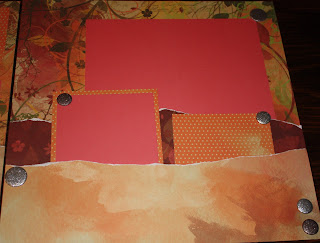
I won't say that this layout is a total failure, but I accidentally dropped my stamp pad onto the cardstock so I had to do some unexpected distressing on it. I really don't like the way it turned out, but it was better than the marked side and the back already had adhesive on it.

It started out like the "Symphony Sweet" on page 24 of Imagaind, but I found I really wanted my base page to play a large roll, so I didn't want to cover it as much as the pattern showed. So I started with an 3 x 11 of the Lagoon cardstock and placed it flush against the bottom and 1 inch from the left side of the page. I placed a 7 x 10 of the striped patterned paper directly into the top right corner, overlaping the first piece. Then I overlapped a 2 1/2 x 12 inch strip of the blue flowers on the striped paper, about 1 1/2 inches from the bottom edge of it. The picutres went on the stripe, and over the "floral belt," but I think I'll go back and add some cream matting to the pictures to help them stand out better. I can also add a few more 3 x 3 pictures onto the Lagoon

cardstock.
For the right hand page, I started with a 4 x 12 of the Lagoon cardstock across the bottom. To this I added a 5 x 10 piece of the stripe to the top left corner, continuing the patter across the break in the pages, and another "floral belt" of the same size and in the same placement as the one on the other page.
I stamped several of the flowers and dots using Pacifica ink over the feathers of the print. Looking at them, it brings back how much I like this paper, yet I'm still not satisfied with the layout. I think the Lagoon is too pronounced. I may go back and make those two large lagoon papers either Chocolate, Pacifica, or maybe even Outdoor Denim.

I made the flower the same way that I did before, stamping the heart into a 3-leaf clover with the points over-lapping, and then adding a backward image of the heart 3 times in the gaps between the ones that are there. When I did it, I used the back side of the Lagoon and Pacifica dotted paper. The back of it was actually in cream and bamboo, so the ink worked really well with it. It stamped the hearts into the flower shape, but still allowed the print to show through, even though the color was altered. (I used the Sky ink.)
I stamped the pointy flower into the center of the big flower using Pacifica and then stamped it again, turning the image so that the new petals hit in between the formerly stamped ones. Then I finished it off with a Chocolate biggie brad.


 This layout isn't an original, so I can't give exact cutting dimensions, but I can tell you that it is the "Enchantment" layout from the Magic Scrapbooking program, on page 78. I can also tell you that I altered the original cutting directions in order to save paper. I cut the 1/2 inch strip of Colonial White for the top of the left page, but instead of making the 12 x 11 big cut for the right-hand page, I made two separate cuts. The first was 1/2 x 12 to go all the way across, but the second cut is only 2 x 10 1/2.


