.

Wednesday, December 1, 2010

Passages - Layout #5


These two layouts were part of a challenge from one of my customers. See once we're done with the workshop, she pulls out some extra cardstock and uses the scraps to make some extra layouts. (Yes, she's very creative!) So I wanted to use more of the paper so she wouldn't have to come up with design ideas herself. And voila! These layouts came out.
I started with a 6x10 of the map paper on the left-hand page and a 2x6 of the postcard paper along the bottom of it. Then I used a 6x12 piece of the stripe (cut with the strip, vertically) for the other side of the paper. On the edge of this, I put a 1x10 of the postcard paper, leaving 2 inches of the stripe at the top showing. I then cut a 5x2 piece of the postcard paper that lines up in the center of the layout, flush with the edge of the map paper. A 13-inch ribbon with a pewter slide stretches across the page at the bottom of the 2-inch section. The other ribbon is described in depth below.
The right page starts with 2x12 strips of map paper, brown cardstock, and stripe, all lined up next to each other. A 6x6 pocket of the brown B&T makes up the bottom right of the layout. For the top right, I used a 6x6 piece of map paper and a 5x5 postcard cut as a mat on top of it.
I used more of the brown B&T as a tag in the pocket and added a pewter hinge at the top to keep it from falling into the pocket. The general measurement of the tag is 3 x 5. A ribbon is stretched from top to bottom of this layout and a 1x3 piece of postcard adorns the top of the pocket.
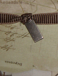

The ribbon at the bottom of the left-hand page is knotted on the right side and the resulting loop is slipped over the side of a spiral clip. That clip is then attached to the layout with a brad, like on other pages. I tied another knot around a photo clip and then wrapped the end of the ribbon around the left side of the layout to complete the design.
All-in-all, I was really pleased with this workshop. I used almost all of the paper in the set and ALL of pewter embellishments along with most of the ribbon. I was really pleased with the results of the effort.

Tuesday, November 30, 2010

Passages - Layout #4


These easy layout were included with the Passage Workshop on the Go kit. I try really hard to make them just like they are shown, but this one begged a change. See the little circle designs are actually four folded circles, like this one.

To make it this way, you fold it in half and then in 1/4 before unfolding it. Then you collapse it so that the two sides fold into the center of two triangular quarters. Then with your thumb, you fold down one top edge of the quarter. It's easier to see the design when using paper that has more of a difference between the back and front. You put 4 of them together to make the complete circle and then put a brad in the center.


I made a much easier version, though, and it only used 2 circles instead of 4. For this one, I used one circle as a base and then folded just a bit of the second circle to make it more of a square. I then put a brad into the center. It doesn't have the folds or bulk of the original, but it is much easier to make and work with.

The top accents are easy with the new Chocolate Ribbon collection. I just anchored one end with a pewter hinge around one edge and wrapped the other end around the other edge of the page. Adding some quick stamps and decorative brads made an easy and fast double layout.

Monday, November 29, 2010

Passages - Layout #3


The designs on these two pages left too much base page showing and I didn't like the effect, so I altered the design to completely cover the bases. The cuts on the left-hand side start with a 1x12 strip of the journaling sheet. The catch with this cut is that it goes across the words so that they will show vertically on the page. All the other cuts are horizontal, with the writing lines. There is a 2x4 cut like that at the bottom right corner of that page. Next to the 1x12 strip of journaling paper is a 1x12 strip of postcard paper. Another postcard cut is a 4x4 at the top right corner. The last base-cover cut is a 6x12, with the lines, on the striped paper. A 5x7 and 4x6 of Brown Bag cardstock finish the collection. The 5x7 sheet is edge-distressed all the way around and the 4x6 has the top edge torn off, just a bit.
On the right-hand page, the top is a 4x12 of the postcard paper. The bottom is a 2x12 of the journaling paper - cut horizontally, with the writing. In the middle of this is a 6x12 of the striped paper, but this time it is cut ACROSS the stripes. That way the stripes will agree between the pages.

The decoration at the top of the left-hand page is worked with a few different cuts. The base is a 1x7 inch scrap of any B&T (I used some postcard paper). On top of that is a 1x12 inch brown B&T paper. I left 1 1/2 inch flat and then made a crease. After a 1/4 inch, I made another crease, then again after 3/4 inches. I continued down the paper, creasing at 1/4 then 3/4 inches until I was left with 1 1/2 inches at the end. On the two ends, I added an open hinge to one and a stamped key hole (stamped in Colonial White) to the other.

At the bottom of the pages, I added a 1-inch strip of Brown Bag, both of them 5-inches long, but torn to differen lengths. On the left-hand page, I embellished with brads and spirals. On the right hand page, I repeated the pleated brown B&T design paper and tucked on end under the torn cardstock and the other one under a pewter photo clip.


The final design, at the top of the right page, started with an upside down 1x8 strip of postcard paper. Along with that, I cut a brown ring out of scrap paper, measuring about 3 inches, and another about 3 1/2 inch circle out of Brown Bag. Both of these I edge distressed, like all the other cardstock pieces. At that point, I folded 1 inch of the postcard strip and secured it with a pewter designer brad and then glued the left edge of the ring to the circle so it would be centered on the Brown Bag circle. Using the entire unit, I stretched the postcard paper to the right edge of the layout and glued it down, flush. Then I glued down the rest of the unit as it layed evenly across the page.

Saturday, November 27, 2010

Passages - Layout #2


Not sure why the colors on these pics are different, but be assured they are both from the same paper pack and really do go together. This layout started the postcard paper from the Passages set. It seemed a perfect partner to the journaling paper in the set, so I put them together and mounted on the chocolate cardstock. The open spaces on this layout was key, because the base paper complimented the others perfectly.

The cuts for the left-hand page included a 2x5 and 2x7 of the journaling paper. From the postcard paper, a 5x5 and a 5x7. From the brown B&T I cut 1 1/2 inch squares (3) and punched some circles to go in the squares from the Autumn Terra Cotta cardstock.

The cuts for the right-hand page include, from the journaling paper, two 2x7 strips and a 5x5 and 5x7 from the postcard paper. Again, 3 squares at 2x2 each from the brown B&T and punched circles from the Autumn Terra Cotta cardstock complete the cuts.

On both pages, ribbon from the chocolate collection is used. For the left-hand side, I used an 8-inch piece of ribbon. I tied one end of the ribbon around a metal tag then gathered up the other end tightly until the ribbon was only about 3 inches long from knot to tip. I glued it down with adhesive (usually Liquid Glass - I LOVE Liquid Glass!) letting the knot and tag hang down and I wrapped the other end of the ribbon to the bag and secured it the same way.

On the right-hand side, I used a 14-inch piece of ribbon. I pulled the white strings a little out of one end of the ribbon and tied the strings in a knot, then out of the other end of the ribbon, I gathered up the ribbon tightly until it was 8 inches long. Before I put down the bottom-left postcard paper piece, I glued down the ribbon, putting the knotted end around on the right side of the layout. The other edge of the ribbon tucks under the postcard paper piece about a half inch. I make sure that the gathered section isn't under the postcard paper.


The circle punch that I have has an edge to it, and it is about 1-inch in diameter. I decorated them with spirals, medium brads, and designer brads from the pewter collection.

I lined up 3, vertically, on the right-hand page and the other 3, horizontally, on the left page so that, when placed together, they look like a continuous design.


I know a LOT of people travel - and this set is perfect for photos from those trips, especially European trips. For me, my best trip is to my in-laws in Oklahoma (a peaceful, but not normally chic, destination) so I'm not really sure how I will use these layouts. If you have any ideas, pass them along!

Monday, September 20, 2010

Passages Workshop #1

I'm terribly delayed in posting this workshop! Life and volleyball season has set in!
This is a wonderfully easy layout that I based on the orange and red printed B&T that came with this set. This left page has a 4 x 12 piece of the smokey B&T along the left edge, and a 4 x 8 piece of Chocolate cardstock across the bottom span, about 1 inch from the bottom edge. In the top section, a 6 x 7 inch piece of brown bag cardstock is layered with a 6 3/4 x 4 1/2 piece of chocolate cardstoco as a mat for a focal picture.
I embellished this side with some satin ribbon. I cut it to 15 inches and then cut it in the middle and retied it for extra flair. I also added 3 brads and one picture clip to the focal point mat.

On the right hand page, also based on the orange and red B&T, I put a 6 x 6 smokey B&T in the bottom right corner and a 6 x 6 piece of Brown
Bag cardstock in the bottom left corner.
I put a 3 x 6 piece of the smokey B&T (turned to the back) in the top/left corner for a journaling section and
I'm embellished it with a hinge attached to the top section. I added a chocolate cardstock mat (7 x 5) embellished with a stamped clock face from
the included stampset (in Chocolate) on some scrap paper and cut out. The scrap paper I used was a bit of the postcard B&T I had left over and just happened to have a light impression of the capitol building on it. I added another satin ribbon done the same way to this page.

Monday, August 30, 2010

Silhouette Cutting

This was my workshop layout for this weekend. I confess, I am REALLY partial to this page and enjoyed putting it together. This is Mari's take on the concept. Let me run it down for you. We used 2 sheets of the floral design paper from the Unforgettable set and 2 sheets of the blue print design paper from the same set. On the left page, the floral was the base. We cut 3 1/2 inches of the blue print and another 1/2 inch of it. We layered the two about 1/2 inch from the left side with the pink side showing on the 1/2 inch strip.

Also on this page, we used part of the floral design page. We cut 3 inches off of the right side of the page and then silhouette cut the branches and flowers. We laid this piece over the blue (5 x 7) mats and the pictures to create an overlay.


We used a couple of silhouetted overlays on the right hand page, too. First, starting at the cut we made before, we cut a silhouette around the flower that we cut through part of, then cut down the stem to the bottom of the page. This cut went into the bottom right corner. After that, we cut alont the large branch on the left hand side of the page and let that section create the left border for the page. Mari added a flip collection using either the CTMH Flip Flaps or clear envelopes and she attached a dated cover to the top of the stack. She added brads and stickease to complete the page including a few extra flowers.


Friday, August 27, 2010

Three Things I Like - No Four!

Mari shared this layout and it really draws in the eye. First, I like the smaller sized pictures that all match in size and shape. The line on the right hand-center is echoed on either side.


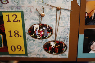
Second, I like the ovals on the left hand page. They would be perfect for a Christmas page, but accent well to the pinning theme of this layout.

Finally, I like Mari's use of her paper. The Desert Sand and the Crystal blue go great with her design paper and I like how she cut out some of the florals from the the design! I also like how something as simple as a 4-inch strip down the middel can create such a focal point.


Thursday, August 26, 2010

Newsprint On Pages

In these layouts, Molly used the Sarsaparilla sets to highlight a 4th grade moment for her son. She plans to make a copy of the news article so that the paper won't yellow, but this set really complimented the picture as well as the news print.


As in some of her other layouts, she used the stickease that came with the kit as her main embellishments. The strip at the top of the page is stickease as is the title, which is raised on 3D foam tape. And do you notice the little imprinted tab on the side of the picture? That's a stickease, too! Also, the little stars at the bottom are part of the set. She used 3D foam tape again on the accent below the strip. It is hard to tell that the card below the strip is stickease, but it is. Molly punched holes in it and threaded hemp through the holes (perfect for this type of paper set!) to enhance the theme of the pages.


Wednesday, August 25, 2010

Sports Layout

Molly Strikes again, and this time with the retired "Rowdy" set. This was one of my favorite sets. I'm not sure if it was the color scheme that I liked so much or the crazy design of some of the papers, but it certainly lended itself to the sports genre!


The way these pages are laid out, they could be Level 1 kits! Check out the edges on the grassy paper in the first picture. Molly has a "paper tearing" tool! I have a new toy to find! It is a metal stick, like a ruler, only with deckled edges on either side. I'm not sure how it worked, even though I saw her doing it, but it sure looked easy! Also in that picture, she added some natural hemp. It is an easy, inexpensive embellishment for boys pages, tomboy pages, or country pages.

While Molly did use some of the stickease to garnish the pages, she also used other accents like these edge anchors on a vellum title piece. The letters might be rubons, but printing on vellum from a computer is also pretty and easy!

Just a side note: Notice how she dates each page. I'm always forgetting to do that and getting my pages mixed up! So simple!

The "DUDE" in the second close-up is part of the stickease for this kit, as is the tan and blue frame under it. The word is raised on 3D foam tape. I'm not sure how Molly did it, but I've done it before and actually stuck down the stickease onto cardstock and cut it out before I mounted it. I've done it before, mounting the foam directly onto the sticky side of the image, but the sticky side still stuck to the paper, wherever I didn't have foam tape. It's a little more work to cut it out, but that way the adhesive on the stickease isn't exposed. Seems like someone told me they put baby powder on the backs of stickers if they didn't want them to be sticky. I've never tried it. Not sure it would work, though. Has anyone tried anything else?

Tuesday, August 24, 2010

More Travel Layouts from Molly!

These awesome layouts are from Molly, highlighting a vacation they took recently. The Moon Doggie patterns worked perfectly for this jungle trip!


Simple embellishments are on this page - just the stickease that goes with the set. I LOVE stickease! I know it will match and it is just so easy to use! It adds to the theme without being overbearing and Molly's pictures are the focal point!


Monday, August 23, 2010

Kawabunga II!

Molly shared some more pages of her family trip. This is the simplest of layouts (an 11 x 11 design sheet on top of a 12 x 12 cardstock) but Molly's details make it really pop.

This is a perfect example of Stickease, our card-weight stickers that go with each paper set. All the embellishements on this page are stickease, the stripe, the flowers, even the title!

Another detail is the variety of picture shapes. I'm believing that Molly just cropped the small pictures at the top right of this page instead of ordering a special size, but you can order large sizes and cut them down. I've order a wallet page once to get 3 smaller pictures, and I've even put 4 pictures together in my photo program and printed them out as one 4x6 to get some 2 x 3 shots for a page I wanted.

Another detail that I like about this page is HOW she cropped the pictures. She used a deckle edge on all of the pics and even used the same edge on some of her mats. I confess, it's been a WHILE since I used any trimmer besides my EURO trimmer, but I'm gonna hafta pull out all my scissors and play a little! I noticed how some of the mats are straight and some are deckled, adding to the variety. Oh and I always love the look of overlapping matted, off-set photos.


Putting it all together, it makes for a great grouping. My favorite of this layout is the section on the far right. The long white mat with all the small, identically-sized photos. It reminds me of the old photo accordions that come out of wallets in old movies!

Friday, August 20, 2010

Kawabunga!

Molly shared her layouts from a recent family vacation. They are gorgeous pics and some of her details really set the tone of the pages and perfected the theme.

On her first page, I was particularly interested in the way she used hemp to highlight some of the stickease in the center. The basic goal of a layout is to draw the eye in and this page certainly does that especially with the central artwork.


Her second page easily flows from the first one. On this page I especially like the way she off-set her photos on the lower left mat. And I LOVE the weaving artwork to set off her journaling. This is a really easy technique that makes a statement, especially for themes like this beach one or rustic rural/country ones. She used 3 12 x 1 inch strips for the vertical slats and 4 other 1-inch strips of various lengths (less than 5 inches) for the horizontal slats. It's easiest to create the weave on the paper instead of trying to make it then putting it on the paper. If it had been me making this up, I would've started by placing just a little adhesive on the vertical slats, right in the middle of them to just barely hold them in place. At that point, I would weave two slats above the adhesive, where the vertical slats are adhered to the base page, and two slats below it. Then I would stick it all down thoroughly.

Molly completed the look by attaching more hemp to the stickease and raising it on 3D foam tape. Oh, by the way, this set is called Moon Doggie and it is retiring so there is precious little of it left! If you want it, please order it from the shopping link at my website; marji.myctmh.com. You'll find it at the "My Reflections 12 x 12" link.

Thursday, August 19, 2010

Heart 2 Heart - Back to School Challenge

When I saw this week's challenge, I just had to show off some of the incredible artwork that was made this weekend at my retreat. I can't take credit for it, but it perfectly fits this category!

Miranda made all of these awesome items especially to get ready for school. First, she created a decorated clipboard for the 7th grade volleyball coach. With this she used stickers and cut itemes as well as design paper cut into a variety of shapes. This is all adhered using Mod Podge, I think.

She used the Cricut to create the letters and words along with some swirlies, and on the front, simple stripes adorn the clipboard. Finally, she completed the project with a mess of ribbons at the top of the clip and lots of bling on the clip itself!


Miranda also used Stickles to decorate a couple of pairs of white sneakers. I'm gonna do this for my twins! It is just their style - but don't tell them about it!!! Anyway, Miranda has one pair for herself - so in character for you, Miranda! - and another pair for her neice! I LOVE how they turned out and can't wait to do some of my own!
But I've been doing back to school things as well! I made 21 journals for our co-op credit teachers a week ago and didn't take a picture of a single one of them! Blah! I used Daydream paper and cardstock to make 2 pockets and added a monogram square at the bottom instead of the blue jean "pocket" in the picture. I also had a bunch of brads: large, medium, one flower, and a photo clip.

I made this one a while back using sanded Outdoor Denim cardstock to immitate bluejeans. The Cranberry grosgrain ribbon goes through stamped "belt loops" on both sides of the book and it ties it together.