We had so much fun at the workshops this weekend! We did a Scrappin' Happy first and followed it up with a "Workshop on the Go" using the new Wings set. It was gorgeous!!! I'll be posting those double layouts in the next few days and I also finished up the Sweetheart layouts for that workshop in February! I won't post those pages until AFTER the workshop, but you can see the flyer for it HERE! Contact me if you are interested in the Sweetheart workshop (or just leave a comment) and I'll get back with you about the details.
I will say that the new spray pens are awesome! So easy to work with and they create such great textures to my paper. I only used one color in them for the Wings pages, but I'm looking forward to blending, first misting one color and then another. I think it could make a great effect! If you're not sure what I'm talking about, just wait another day! On February 1st, the new Spring/Summer Idea goes "live" and you can view it at my website; marji.myctmh.com. The spray pen is on page 121, so check it out. And watch for the new posting of my Wings workshop pages starting tomorrow. You'll see exactly how that super cool pen works!
Monday, January 31, 2011
Sunday, January 30, 2011
Mistletoe Workshop Layout #5
 This is the layout that actually came in the brochure with the Mistletoe workshop. I hope you will order it before they are gone forever. Even if it's February already, go ahead and call me! I MIGHT be able to get the workshop kit, still.

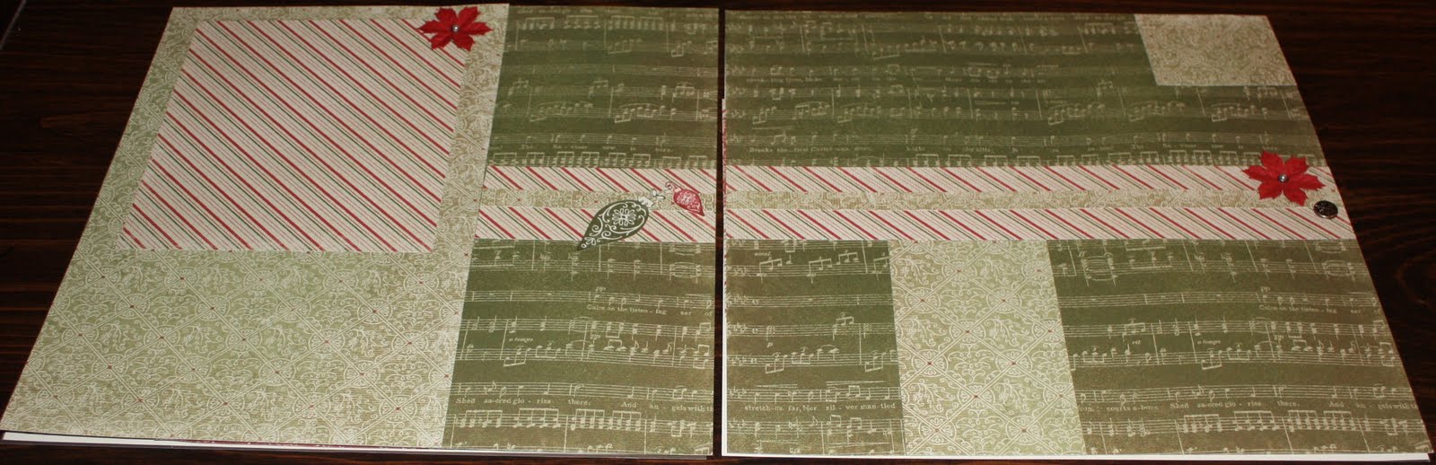
This is one CUTE double, but again, I must confess to some instruction altering. See the large holly paper section at the top of the left page was actually supposed to be a large picture (9 inches wide). Now I don't know about you, but I don't print out pictures that big and I don't
 REALLY want too many of them in my book. In fact, with 4 kids, 3 nephews, and 1 niece, I prefer to have MANY little photos to save the memories - since that's what I have such a bad time with - instead of one big photo with lots of details. So, I cut a 9 x 6 of the paper instead and plan to house 2 to 4 smaller photos in the space instead of a great big one. As for the blank area on the right, that is for three 4 x 3 photos in a row. Not sure if I'll do that, or a 4 x 6 and then a smaller one.
I really like the embellishments in this one, though. The kit comes with the Mistletoe brad set that includes the poinsettias, the pretty green framed brad that you can see and the etched pewter brads. I added to the texture by raising a couple of the stamped images up just a bit. And the ornament in the center of the title card will be the letter O whenever I figure out what I'm going to say. "Joy comes in the morning" or "So much fun." The brochure says, "SNOW much fun," but it just doesn't usually snow around here at Christmas and this year was no exception. Maybe I'll make it "O Christmas Tree."
If you want this set of the Olivia that I've shown, today is the last day to order it! Email me!!!!
Friday, January 28, 2011
Mistletoe Workshop Layout #4
 I'm pretty musically oriented, so I LOVE this paper and I wanted to make sure that plenty of it would be seen so I chose a layout with a lot of the base page open. This one is called "Mesmerize" and it is only page 34 of Magic, Although I changed it just a bit - go figure??? Really it was a tiny change. The 3 x 5 piece of green print B&T was really smaller in the pattern to make way for a 2 1/2 x 3 picture, but I thought I might put a 4 x 6 across the "crack." That is, I'll cut the picture (in a non-essential place) and divide it between the two pages with the musical matting around it. I didn't really want a picture to be part of the boundary for the matting, so I lengthened the green print to complete the edge.

I decorated this with just a few accents, a couple of stamped, cut out images and 2 poinsettia brads with a pewter brad seemed all that was needed. I'll probably move the ornaments to the bottom corner and use that center stripe for the titling of this page.

This layout can hold a TON of photos! I'm thinking: one in the candy-stripe mat, another small one below it, a 2 1/2 x 3 inch pic on the right side under the green print in the corner and two more of the same size or a 3 x 5 tall one next to it. A 4 x 5 in the blank spot next to that and another one in the bottom right blank spot. Add the divided 4 x 6 in the middle, and that accommodates 7-9 photos easily! I wonder if I have enough pics of my kids caroling???
Thursday, January 27, 2011
Mistletoe Workshop Layout #3
 Now this layout is just plain and even a little boring, but try to picture the right hand page with a 4 x 6 photo about the journaling card and a 3 x 3 photo under the diagonal stripe. Then picture a title across the top of both pages and either some extra 5 x 4 photos along the right side or more journaling and a picture at the bottom. Then on the left hand side goes one 6 x 6 picture or two 6 x 3 pics. Another 3 x 3 goes next to the candy strip and a final 6 x 4 goes under the green print B&T.

I know that's a lot to imagine and without the pictures,
 this layout just isn't done any justice, but it will look awesome when it's done! It is called "Love Potion" and can be found on page 18 of the Magic book although I altered it a little. The pattern calls for the two 4 x 6 pics that are on the inside of each page to be right next to each other. I didn't like the way that looked as much so I pulled the Colonial White journaling cardstock down to the bottom of the grouping. Once the pics are on, I'll stamp the outline of the groupings, but I didn't want to do that ahead because I may be adding extra pictures. Boy, I really need to get some pics printed!
One last item is the little pocket at the top. This can be used as a souvenir pocket, but I think I'll position some cropped pics and stamped ornaments spilling out of the pocket. Don't worry, I'll repost this one when I'm done with it. Probably after my retreat in February.
Wednesday, January 26, 2011
Mistletoe Workshop Layout #2
 This layout is called "Showtime" and the
  instructions for it are on page 106 of Magic. I didn't have to make any changes for this layout. It was perfect just the way it was! And I love the way these papers go together for this layout. It's almost too much, though so the only stamping I did was the "Noel" in the bottom-left and top-right.

The only other embellishment on this page is the white poinsettia brad in the bottom left corner. This double is begging for pictures, but it just doesn't need anything else!
Tuesday, January 25, 2011
Mistletoe Workshop Layout #1
 This layout is called "Performance" and all basic instructions for it are on page 48 in the Magic "how-to" book by Jeanette Lynton, the founder of Close to My Heart. Something I love about this program is the pattern CD that is included with the books. I used them for the parenthecal patterns on the bottom of the left page and the side of the right page.

I adjusted the left hand side of the page. The 4 1/2 x 7 piece of green print B&T was actually only 1 small B&T and a 2 inch open space. I didn't like the way it looked on this page, so I filled in the open spot. Also, the original layout called for 1/2 inch border all the way around each page. But I thought I might use the open brown section as a mat for my pictures instead of filling them in entirely so I moved both pages to where they would meet in the middle of the layout.
For the decorations, I random stamped (using 2nd generation stamping) on the right side card and added two cut out ornaments and a poinsettia brad that came with the set. For the left side, I just added the one cut out ornament. I raised all the cut-outs on 3D foam squares. Finally, I added some "stitching" with my Cocoa marker along the parenthetical edge of the two cards.
Monday, January 24, 2011
Olivia Workshop Layout #4
I was so inspired by this paper set that I did a little creative cutting on this layout. Even though I cut the tar out of the light floral B&T, I still had a 4 x 8 section leftover to use on my first layout and was able to cut that flower out of the leftover. 


Sometimes when I do these free-handed cuts, I start with a basic square cut, but I didn't with this one. I just followed the lines that were already part of the design. Once they are cut out, the 4 x 8 is square cut, avoiding the large flower that I used on the 1st layout. As for the est of the page, I cut a 4 x 12 and a 4 x 2 of the polka-dot Sunset B&T and tore the long edge of the 12 x 4
 and 2 edges of the 4 x 2. All these edges I distressed by scraping them through Bamboo ink. (Gold ink would've worked better for it if I had any!)


 and 2 edges of the 4 x 2. All these edges I distressed by scraping them through Bamboo ink. (Gold ink would've worked better for it if I had any!)
I added a couple of Shimmer brads to opposite corners of the layout. To decorate the top right I stamped on a scrap of some leftover B&T in Barn Red. I overlapped several large leaves and then cut out the whole grouping together. If I had it to do all over again, I would probably have matted this grouping on a lighter color of cardstock, like Bamboo. That would really make it pop!
Friday, January 21, 2011
Olivia Workshop #3
This is the layout that came with the Olivia workshop. A color brochure with complete instructions is included with the kit. If you buy ANY set, this one should be the one! It is positively gorgeous! 

I've only just decided what photos to use on this page and I can't wait to get them on there. The brochure includes three 5 x 7 pictures with 2 of them landscapes on the left page and the other portrait on the right page. It also includes six 2 x 2 photos with 3 on the left side of each page. All of the photos match the rest of the paper by being sanded on the edges - yes, on the edges of the actual photos. AND the portrait photo on the brochure shows a little of the picture sanded off and a stamped sentiment in the sanded area. I am SO doing that!


I've only just decided what photos to use on this
 page and I can't wait to get them on there. The brochure includes three 5 x 7 pictures with 2 of them landscapes on the left page and the other portrait on the right page. It also includes six 2 x 2 photos with 3 on the left side of each page. All of the photos match the rest of the paper by being sanded on the edges - yes, on the edges of the actual photos. AND the portrait photo on the brochure shows a little of the picture sanded off and a stamped sentiment in the sanded area. I am SO doing that!
Thursday, January 20, 2011
Olivia Workshop Layout #2
 This layout isn't an original, so I can't give exact cutting dimensions, but I can tell you that it is the "Enchantment" layout from the Magic Scrapbooking program, on page 78. I can also tell you that I altered the original cutting directions in order to save paper. I cut the 1/2 inch strip of Colonial White for the top of the left page, but instead of making the 12 x 11 big cut for the right-hand page, I made two separate cuts. The first was 1/2 x 12 to go all the way across, but the second cut is only 2 x 10 1/2.

I distressed all of the Colonial White pieces in Bamboo ink the same way. I apply the ink to an empty block and then swirl it onto the paper in little circles until most of the ink is gone. Then I reink the block and repeat the process until the distressing is the way I want it.
On both pages, the base is Bamboo. The top, orange section is the backside of the bright green, floral B&T. The middle section is the watercolor B&T and I put just a few random stamps using t
 he small leaf stamp (that comes with the workshop) in Barn Red ink. Then the bottom section
 that spans the 2 pages is the stripe. I didn't randomly stamp the stripe, it actually comes that way, but I did stamp the Bamboo base at the bottom. I used Bamboo for the large stamp, Autumn Terra Cotta (as I didn't have the Sunset stamp pad at the time) in a 2nd generational stamp with a long, skinny leaf, and I used the same small leaf in Barn Red, too.
I added a "Delight" to the top of this page, thinking that it would be appropriate no matter what photos I choose to put on the page. I also randomly placed some of the Shimmer brads to give the layout a finished look to it.
Wednesday, January 19, 2011
Olivia Workshop Layout #1
 Since I already had some of the pages out, even though I haven't finished the pages with photos, yet, I thought I would go ahead and give the instructions for these pages. This double is my own layout, so I can actually give cutting dimensions.
The right pages is a pocket page with inserts that act as photo mats. I always wondered how anyone could use a pocket page in their album because the inserts would be so hard to reach from the top. They are, if you're reaching in from the top, but not if you cut a slit into the plastic. You will need to slice the page protector the width of the insert plus a hole punch on each side so the slice won't extend too far. I usually make my slice just below the top of my insert. That way my insert can stick out just a little without removing protections for the photo.


The left page is a continuation of the right, in look, but it isn't a pocket page. I used some little "belts" to continue the theme, but even though the pictures can tuck up under them, no slits are necessary to view these as they are not removable.
The left base is the darker leaf B&T and the right base is the light floral B&T. The left layout has a 4 x 12 cut (although it can be 4 x 8) of the light floral B&T and is aligned on the right-top of the base page. A 5 x 12 cut of the watercolor B&T lies at the bottom of the base page, but I tore the top edge all the way across before I stuck it down. On top of this is a 4 x 6 of the Sunset polka-dot with the top edge torn. I added another strip of the paper cut 1 1/2 x 6 that I actually wrapped around the corner of a 5 x 7 piece of Smoothie paper. I tore the long edge of the strip first. I also added a 3 x 3 piece of Sunset polka-dot at the top-right. The final card is a 4 x 6 Smoothie mat off-set on the left side of the page. I cut out one of the flowers from the light floral B&T and overlapped the 4 x 6 mat as a final touch.
 right-top of the base page. A 5 x 12 cut of the watercolor B&T lies at the bottom of the base page, but I tore the top edge all the way across before I stuck it down. On top of this is a 4 x 6 of the Sunset polka-dot with the top edge torn. I added another strip of the paper cut 1 1/2 x 6 that I actually wrapped around the corner of a 5 x 7 piece of Smoothie paper. I tore the long edge of the strip first. I also added a 3 x 3 piece of Sunset polka-dot at the top-right. The final card is a 4 x 6 Smoothie mat off-set on the left side of the page. I cut out one of the flowers from the light floral B&T and overlapped the 4 x 6 mat as a final touch.
 The right layout starts at the bottom with a 6 x 12 of the dark leaf B&T with the top edge torn all the way across. It was placed directly on the bottom of the base, but the torn side is left clean of adhesive so that the pocket can be made. On top of the dark leaf pocket, also directly against the bottom of the base is a 5 x 12 of the watercolor B&T (top edge torn). I applied a u-shape of adhesive to the B&T to make a pocket section, as well. Under the dark leaf pocket I tucked a 7 x 8 piece of Smoothie as a photo mat. The inserts for the watercolor pocket include a 4 x 5 of the Sunset polka-dot and a 5 x 7 of the same paper overlaid with a 6 1/2 x 4 1/2 of Smoothie cardstock. I added the Shimmer brads to the two inserts to act as handles.
 I didn't use any stamping on this page as it was perfectly embellished with just the shimmer brads and I felt more stamping would make it quite busy.
Tuesday, January 18, 2011
Olivia, Mistletoe, and Hooligan Workshop Sets Will be Gone at the End of the Month!
This is just one of the Olivia layouts that I'll be posting and giving directions for in the next few days. This is one of the most beautiful sets I've worked with and I highly recommend it! The kit comes with a stamp set that was created especially for this workshop and it also includes the shimmer brads in bronze, silver, and gold. The set is only available through the end of the month. Contact me this week if you want to or der it! See the flyer for the workshop and another example HERE.


Hooligan was also a fun workshop, but I don't have any pictures of it. However you can see an example of it on the flyer HERE. It, like the others, comes with a special stamp set and a set of embellishments as well as a color brochure.
 der it! See the flyer for the workshop and another example HERE.
These layouts were made with the new, traditional Mistletoe set. This set makes some BEAUTIFUL layouts and it again comes with a set of embellishments (Mistletoe) and a stamp set created for the workshop. Both of these sets come with a full-color brochure, by the way. But like the other, the Mistletoe workshop kit is only available for the rest of the month of January. See the workshop flyer and another example HERE.


Hooligan was also a fun workshop, but I don't have any pictures of it. However you can see an example of it on the flyer HERE. It, like the others, comes with a special stamp set and a set of embellishments as well as a color brochure.
Friday, January 14, 2011
Magnifique Layout #5
 I won't say that this layout is a total failure, but I accidentally dropped my stamp pad onto the cardstock so I had to do some unexpected distressing on it. I really don't like the way it turned out, but it was better than the marked side and the back already had adhesive on it.
 It started out like the "Symphony Sweet" on page 24 of Imagaind, but I found I really wanted my base page to play a large roll, so I didn't want to cover it as much as the pattern showed. So I started with an 3 x 11 of the Lagoon cardstock and placed it flush against the bottom and 1 inch from the left side of the page. I placed a 7 x 10 of the striped patterned paper directly into the top right corner, overlaping the first piece. Then I overlapped a 2 1/2 x 12 inch strip of the blue flowers on the striped paper, about 1 1/2 inches from the bottom edge of it. The picutres went on the stripe, and over the "floral belt," but I think I'll go back and add some cream matting to the pictures to help them stand out better. I can also add a few more 3 x 3 pictures onto the Lagoon
  cardstock.
For the right hand page, I started with a 4 x 12 of the Lagoon cardstock across the bottom. To this I added a 5 x 10 piece of the stripe to the top left corner, continuing the patter across the break in the pages, and another "floral belt" of the same size and in the same placement as the one on the other page.
I stamped several of the flowers and dots using Pacifica ink over the feathers of the print. Looking at them, it brings back how much I like this paper, yet I'm still not satisfied with the layout. I think the Lagoon is too pronounced. I may go back and make those two large lagoon papers either Chocolate, Pacifica, or maybe even Outdoor Denim.

I made the flower the same way that I did before, stamping the heart into a 3-leaf clover with the points over-lapping, and then adding a backward image of the heart 3 times in the gaps between the ones that are there. When I did it, I used the back side of the Lagoon and Pacifica dotted paper. The back of it was actually in cream and bamboo, so the ink worked really well with it. It stamped the hearts into the flower shape, but still allowed the print to show through, even though the color was altered. (I used the Sky ink.)
I stamped the pointy flower into the center of the big flower using Pacifica and then stamped it again, turning the image so that the new petals hit in between the formerly stamped ones. Then I finished it off with a Chocolate biggie brad.
Thursday, January 13, 2011
Magnifique #4 Layout
 This layout is a slight alteration on the "Leading Lady" on page 16 of the Imagine book. The book shows that there can be 5 pictures on this double layout, but I added another on the right-hand page. In fact, using smaller pictures than the ones they used in the book, I could probably add 2 to 3 more pictures to the pages easily.

Embellishing this double was so simple with the Chocolate Mini-Medley and the stamp set that accompanied the kit. The first image that I made was the large flower at the bottom left corner of the left hand page. I made it with the heart stamp that accompanies the set by overlapping three heart images. Then I turned the heart upside down on the block and stamped it 3 more times to fill in between the other three hearts, to make the large flower. Then I stamped the largest of the flower images and placed a cream biggie brad into the center of the flower. I stuck it down into the corner of the page and then trimmed off the excess of the flower.

For the other embellishments, I stamped a variety of flowers, layering the different images and different colors (Pacifica, Lagoon, Sky, and Chocolate) as well as using 2nd generation stamping. That sort of stamping requires you to ink up your stamp and first stamp it onto scratch paper before applying the ink to your project. It creates a lighter version of the original. Then I cut out all the flowers in different ways and stamped a dot or put in a brad into the center. I also used a few of the paper flowers that came with the set , as well.
Subscribe to:
Posts (Atom)


