.

Wednesday, June 30, 2010

Cherry-o Workshop Layout #2

I think I'll end up liking this layout more when I get the pictures on it. I love the paper, just a 3 x 12 strip of the cherry B&T at the top, but my embellishments just don't show up very well. I plan to use vellum paper, though, (the whitish, translucent paper) for the title bands on both pages, held down by the biggie brads that really are up in the corners of the cherry paper but are camouflaged by the print of the B&T.

The red print is the base of this page and I have started using the design paper (Close to My Heart's background and texture paper) as base pages more often. This page is accented with a simple cherry stamp design where I tied a piece of chocolate Waxy Flax around one of the stems. A large button, again with a Colonial White designer brad, completes the grouping at the bottom left of the page. I have some extra paper left over from this kit that I will use for photo mats.


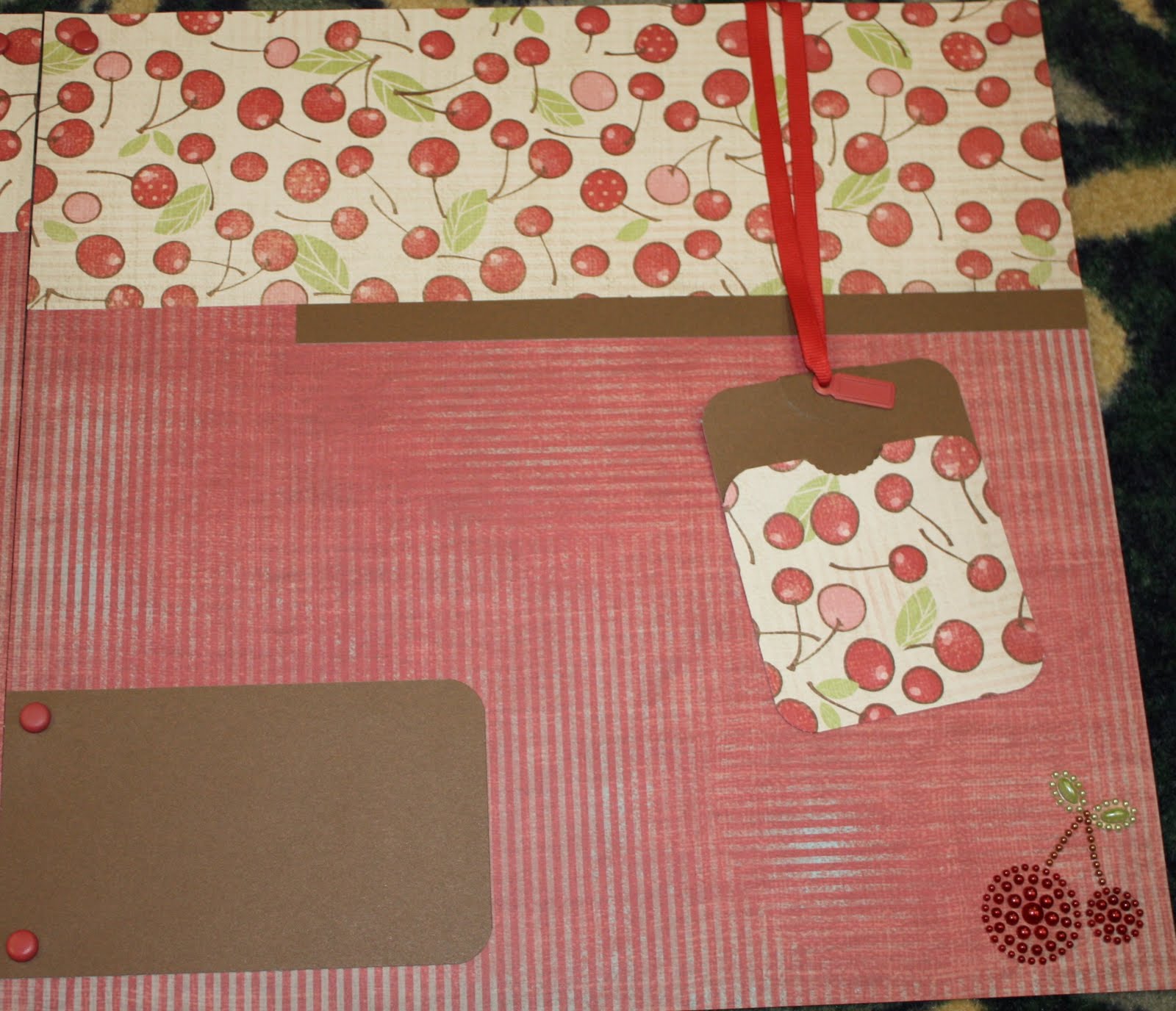
On the second page, I used a 4 x 12 across the top, lined with a 9 x 1/2 inch card stock strip. (Incidentally, the strip will be up against a 3 inch photo.) I cut a 3 x 4 inch chocolate tag with rounded corners for a photo or journal pocket. The front of the pocket was made with a 3 x 3 square of the cherry B&T. I cut a notch out of the center-top of the square, after I rounded the corners, using the edge of a circle punch. I also made a circle punched out of the chocolate cardstock, folded over on itself for the top center of the tag. The rest of the tulip ribbon attaches this tag to the layout (CHEAT ALERT! I actually adhered, lightly, the tag to the page so it would stay in one place!) and another metel tag from the mini medley set hangs in front of the tag. The brown journaling spot near the bottom measures 3 x 5 and has the right corners rounded. Held down by the biggie brads, I plan to added my journaling to a piece of vellum attached to the card.
As a final embellishment, I added another Cherry-o Opaque to the bottom-right of the layout.

Monday, June 28, 2010

4th of July Door Hanger

This is a really simple craft that I cooked up for the residents of a local retirement home nearby. Doing workshops at a retirement home is a challenge because I want to offer a really nice-looking project, but I have to be mindful of the ailments of older hands and eyes.

For this, I just cut a 12 x 6 of white cardstock and then cut about 3 1/2 inches off using the coluzzle to round the top edge. Inside, roughly 1/2 inch from the tope edge, I cut another circle measuring 2 3/4 in diameter. (On the large circle coluzzle template, it is the smallest outline.) I also added 6 small hole punches about 3 inches from the bottom of the card, 1/2 inch from either side and 1 inch between each hole punch.

Using the Celebration stamp called Your a Star, the ladies who joined me stamped the largest 2 stars in Heavenly blue, and the medium 3 stars in Crystal blue. They then stamped the smallest stars in Moonstruck and added Glitz to many of the small ones to sparkle the page.

After all the stamping was done, they added the ribbon to the bottom section of the cards. They inserted 4-inch cranberry ribbons to each of the holes and taped them against the back of the card. They also added the little bow to the top of the card using about 7 inches of ribbon.

With that done, the residents added pre-glued letters that I had made with my Cricut. (My daughter spread on the Mono-Adhesive because some of the pieces were really small.) The residents found it easy to place all the pieces and then used our Glitz again to added sparkly polka dots (and some of them added lines and dashes) to the letters.

It was a fun project and took very little time to prepare and make. In fact, two of the crafters made a second project in no time!

This project was a perfect one to enter into this week's Heart 2 Heart Challenges. If you want to take the challenge, check out the blog at heart2heartchallenges.blogspot.com.

Cherry-o Workshop Layout #1

This workshop was so much fun to put together. I'm not exactly sure which pictures I'll use on here, but I have a couple of events including some picnics that I will need to scrapbook this month.

I love the embellishments that worked with this set, too. And may I just say right here, that doing these monthly workshops has REALLY helped me get over being embellishment challenged! I'm loving doing the bling thing!

On this layout, the striped paper is cut to 4 x 12 inches and laid on a tulip card stock base with an 8 x 12 piece of the cherry checkered B&T aligned at the top of the base. Two biggie brads from the Tulip mini-medley set are at the top of the cherry B&T. A 14-inch piece of Tulip grosgrain ribbon, also from the mini-medley, is knotted around a tag from the same set.

The stamp set that comes with this workshop kit is so cute, and the checkerboard stamp gives an effect of a zigzag stitch and I interupted it with the sentiment, "Happy Day."

I used 2 buttons from the Mini-medley at the bottom left of the page. The smaller one has a bow around the eyes using Chocolate Waxy Flax. The larger one is connected to the paper with a Colonial White Designer brad through the eyes.

At the top left of the page, I added a gorgeous Opaque from the set that was made especially for Cherry-o. Just so you know, the workshop kit comes with the full paper pack, the matching stamp set, a full-color brochure, and the Tulip Mini-Medley set. Along with those, I added the Opaques, the Colonial White designer brads, and the Chocolate Waxy Flax for embellishment.

For the right page, again on a Tulip card stock base, is an 8 x 4 striped B&T, set at the top right corner, and an 8 x 8 piece of cherry checkered B&T.

Like the left page, this page has the chocolate checkered stamp-print across the top of the red card stock. This time there is no interuption.


All the papers of this layout are edged-distressed in chocolate ink. To accomplish the effect, the stamp pad is scraped across the edge of the paper piece, leaving a dark edge and little scrape marks. Sometimes more scrapes, sometimes less and there is no perfect way of creating it. Even the artwork card (a Colonial White card measuring 2 x 2) has a chocolate edge.

This page features 2 different techniques: Rock and Roll, and Masking. To create the artwork, ink up the bowl stamp in Crystal Blue and stamp it on the art card. (Make sure you ink it up thoroughly or maybe even stamp it twice to get a complete image.) Then lightly "roll" just the edges in chocolate and re-stamp the image directly on top of the first. If you've never done the "Rock and Roll" technique, you might want to practice it several times on scratch paper before you do it on your page. For the second technique, you'll need a post-it note or another paper with temporary adhesive on it. Lay the post-it at the top of the bowl to protect it from other ink, then stamp the cherry stamps in Tulip ink within the top edge of the bowl. Add some chocolate stems to the cherries and leaves inked in Sweet Leaf. Do the Rock and Roll technique with the chocolate ink on the leaves, just like you did on the bowl. Add the sentiment to the top and bottom to finish the artwork and place it 1/4 inch in from the top and right edges of the page.

At the bottom right of the page, another Opaque gives a little bling effect to the layout.

Biggie Brads are added to the top of the cherry checkered paper, just like on the left page and as a final addition, another large button accents the top-left of the 4 x 4 journal box added to the bottom-left of the page (in by 1/4 inch from the bottom and the left edges, just like the artwork is at the diagonal opposite).

Thursday, June 24, 2010

My Baby is GORGEOUS!

Yes, I'm shamelessly partial! These pics were taken from the recent Christian Homeschool Prom. This evening is an amazing event from the decorations, to the food, to the theme, to the music! This year's theme was the Golden Age of Hollywood and there were sets all over of famous movies like High Noon, Phantom of the Opera, Singing in the Rain, Gone with the Wind, and the Wizard of Oz. The whole family took part this year, with Katie and Richie attending as special guests (and entering the swing dance competition together) Paul was on the security team and I was a photographer, and Brittany and Breana were Munchkins on the Wizard of Oz set. Needless to say I had LOTS of pictures and LOTS of journaling and I was able to put all of it on this Studio J layout. It won't win any awards, but it will bring a LOT of joy every time I look back at it.

Did I mention how much easier it is to journal on digital pages than on regular pages? I don't have bad handwriting, but I always make mistakes and they don't make correction fluid in Close to My Heart's 60 different colors! (Hey, that's an idea!) This layout is also another example of retired papers! This is the Elegant Floral paper. Perfect for prom!

Wednesday, June 23, 2010

This is just plain EYE CANDY!

And NO, Gary, I'm not talking about your best impression of Larry Boy!!!

The way this layout lays out is just so stinkin' clever!!! It perfectly draws the eye in to the photos and there is a new treasure at every turn. I particularly like the small pictures. I didn't want to trash the little photos - precious memories! - but they were just too small to come into focus as a full-sized picture.
And again, the Stickease is all available in different, adjustable sizes along with the buttons and brads and ribbons. This just doesn't get any easier!

Tuesday, June 22, 2010

Types of Titles

This was one of the first layouts I made with Studio J. I particularly like the way the title works with the words simply across the layout instead of on a mat or background.

Stamped titles look sharp and distinct but must always have a base. Stamping over several layers of paper leaves gaps in the images. Stickers can be annoying because they won't come back up if you accidentally set them down, and because once you use a letter, it's gone. Cutting or punching letters provides an alternative to stamping, but they can also prove difficult to adhere to the layout. With digital scrapbooking on Studio J, I have tons of options for the title and it floats on top of the rest of the design perfectly.

If you haven't tried Studio J for free, why not??? Find the link at my website: marji.mycmth.com

Monday, June 21, 2010

Adjusting Photos into Focus

Most of the prints that I got from this camp out were a little grainy and somewhat out of focus. But since I can make them smaller than a regular print just by adding a border, I can really bring them into focus. And I get to use the paper I like most over and over again. (My favorite in this set is the blue plaid.) I never run out and I never have to go on a search for a coordinating paper because they're all together. Try Studio J for yourself at the link at my website. marji.myctmh.com

Friday, June 18, 2010

I don't have to buy ANYTHING I don't want to use!

I really like the new Animal Cookies paper set. The papers shown in the layout are awesome for all sorts of events, but the others in the set would be a little harder for me to use. Cartoon animals, Number paper, and a variety of red hearts are great for little kids (and maybe years ahead of me when my girls are all teenagers), but unless just the right situation comes up, it will be unlikely that I would use them anytime soon. But since I'm using them on Studio J, I don't have to waste the rest of the kit or find a place to store the odds and ends. I also LOVE the fact that the stickease is available for all the kits online - ALL of the Stickease and I can use them more than once! Hurrah!

Thursday, June 17, 2010

Studio J Makes Things Super Simple!

This is such a cool layout. If you're like me, you always have plenty of pictures for your events. It is often a challenge to choose between the pictures! But this layout can really pack in the pics and still look well-designed.

I admit, though, that the first time I did this layout - on my own, with paper and adhesive - I cut the far right/bottom picture with the wrong angle and had to cut it again. It wasn't a BIG deal, but it gnaws at me that my picture has an extra cut line through it.

Such is not the case with Studio J! I just drag and drop the pictures and then I can align them as I need to so that the best parts of the pictures show.

Wednesday, June 16, 2010

I Have 5 Photo Albums

Yes, I really do. I know, I'm a glutton for punishment! And, natuarlly, I find I'm terribly far behind in them! I have a several-year hole in my albums when life was just too busy to scrap-book, but I've got tons of pictures from this time period because my kids were all young.

But Studio J is helping me catch up and I know I showed you some of my latest layouts a couple of weeks ago, but my recent ones are so cute, so I want to showcase them as well. I used the Blue Ribbon pack with this one. I like that pack okay, but have never been a huge butterfly fan so I never bought it. With Studio J, I can use just the parts of the paper pack that I like and get a great layout that works perfectly with my twinkies' softball team (The Firecrackers) without having to find a way to use the papers that aren't really my favorites.

You can try Studio J for free at my website: marji.myctmh.com. Just click the Studio J link!

This layout was posted only a little over a week ago. But this week's Heart 2 Heart Challenge is Patriotic projects, so I'm linking this layout. Afterall, what is more patriotic than baseball? Try a challenge for yourself at heart2heartchallenges.blogspot.com.

Tuesday, June 15, 2010

Father's Day Tag Book

I used pieces of old retired paper packs and stickease to make this. I even cut the tag out of the top of a Level 1 layout because I was out of matching paper, but I really like the way it turned out. I sanded all of my cardstock to make it match the design of the paper pack and used 2 pieces of 8 x 12 sheets of it, adhered together, to make the accordian. I also added an envelope shaped flap from the leftovers and attached a loop of hemp using a square pewter brad. For the inside, the pockets are mostly made of stickease from the pack and snippets of leftover paper. I love the rich colors of this autumn paper pack! For the most part, they are: New England Ivy, Barn Red, Cocoa, and Autumn Terra Cotta, but I think Goldenrod is in there, too, and I know I used some Colonial White for a couple of tags.

Sunday, June 13, 2010

Cute and Easy!

These layouts were created by Audra and I love them because they are so easy, yet FUN!

I think the key with these is using design paper as the base for the layouts. Right away the layout has an interesting foundation for the pictures. Audra enhanced that by using more design paper (different but coordinating designs) as the mats for each of the photos.

The circles are especially appropriate for these layouts because so many of the design papers have a polka dot design to them. The circles mirror that effect and also make and interesting alternative for the photos.


Finally, Audra drew the whole layout together with the ribbon she used on the two layouts. It is exactly perfect, pulling together all the colors she used!

Friday, June 11, 2010

Help me name my retreats!!!

I have gotten SEVERAL suggestions for retreat names, and I need to decide on one. You can help. Just take the survey at the left margin and let me know which name you think would reflect the retreats the best.

Totally SUMMER Layouts

I'm not positive, but I THINK this is also a Kym Glass design. She was telling me about the little paper dolls she found up in Oklahoma. This layout looks like it is sponged in Ocean ink. You can get a textured look like this using a stipple brush. It does take some patience to apply the ink a little at a time, but the effect is well worth it. Kym also added extra Ocean ink arount the outside edge of the paper by scraping it directly against the stamp pad. You can achieve a more subtle look by using a sponge to scrape against the edges instead of applying it directly from the pad.

Nothing else on this layout is CTMH, but it's just so cute I had to include it in my "library."

Thursday, June 10, 2010

Miracle Layout Set

This week, the challenge for the Heart2Heart blog (heart2heartchallenges.blogspot.com) is layouts. Well, I'm ALL OVER that!!! I do make cards, but with 4 kids and 5 albums to keep up with, (not to mention the deadlines of having them caught up by the graduations of each kid - 1 down!) scrap-booking is my chief pasttime, so this was an EASY challenge!


I didn't make too many layouts at my retreat this past weekend, but I made a set of these for my girls' albums. The Miracle set that was the special for National Scrapbooking month was perfect for these pictures and the colors in them. I added several sheets of Sweet Leaf textured cardstock to extend the set in order to cover the 4 double layouts I needed. (The set was made for only 2 doubles.) The instruction sheet suggested adding another bright color as an accent since all the paper design colors were pretty muted so I used Moonstruck to color the Irrisistible embellishments and as the waxy flax for the buttons. I used the Love Letters Rub-ons for the titles and a few little extra accents, and I added the Glitz Glitter Glue to every dot I could find on the design paper. This gave it a great sparkly look and a textured feel to the whole layout, but it's a little hard to see in the distant pictures. It's easier to see in this close up picture.

Wednesday, June 9, 2010

My Retreat Workshop - a la Christy Land

This was Christy Land's take on my retreat workshop from the one I had in late April. I can't believe I didn't take any pictures of my own layout! The workshop started with wetting and wrinkling (carefully) the base paper which was Dutch Blue cardstock. (For Christy's page, she used a second layer of Sunflower cardstock as the bases to the pages to give strength to the layout, but the original had the blue as the only base.) Anyway, once the blue is good and wrinkled, Christy flattened it back out and let it dry overnight. She even ironed it to flatten it fully. After it was totally dry, she then sanded the peaks that were caused by the wrinkles, giving the bases an awesome texture. Adding some ink of the same color can enhance the texture.

For the workshop, I taught the gals how to make fancy full flowers. Start with punched circles and fold each circle into thirds, making a pie shaped piece. Christy made the green side of her B&T as the center of the flower and the orange as the edge. Mine also were full circles, but she utilized the stems printed on the floral B&T to make have flowers, using 3 little pie pieces and a coordinating brad as the center, holding it all together.

It's really easy to see on this last picture how the positioning of the "flowers" makes all the difference in the world. She also introduced sewing to our retreats this time, using a straight stitch around the outside edges of the blue, and a zigzag stitch between the different paper pieces.

Monday, June 7, 2010

More Veranda layouts by Kym Glass!


Kym Glass did it again! And I doubly love this layout because almost all the embellishments are Close to My Heart! First she started with the Veranda pallette and a rather simple layout. The Juniper cardstock is the base and she started the enhancements by distressing the bases with a crosshatch in chocolate (achieved by scraping the stamp pad corner across the edge of the paper). On top of the base, she started with two 6 x 12 pieces of the cream floral B&T (background and texture or design) paper, one on each base - about 3 1/4 inches from the bottom. On the left side, she added a 1 1/2 x 12 strip of the Juniper floral across the bottom of the cream and another one across the top of the cream on the right-hand page.

Then she started REALLY decorating! She added a simple zigzag sewing stitch where the Juniper strip met the cream paper in brown thread on both pages. For the other sides of the cream paper, also on both pages, she attached some Garden Green grosgrain ribbon. On the right hand side, she just wrapped around the back and didn't need to worry about the other side as it would be covered with the circles she would add, but on the left side, she created a great illusion. First she attached a photo hanger from the copper mini medley to the inside edge of the paper, letting it extend over the ribbon she had already attached there. Then she attached a simple knot to the ring of the photo hanger making it seem as though the ribbon that stretched across the page was attached to the hanger. Gotta love that clever lady!!!

As to the journaling area, I think that the "Things that make me smile" piece is actually a stickease from the kit. I know the striped paper under it is a designer paper from the Veranda pack. My guess is that she cut some Cocoa cardstock into the frame that is shown using a Cricut machine. She probably also cut the striped paper on a smaller setting, the very same way! On that Stickease piece, she added "glitter" brads and some bitty sparkles - both CTMH embellishments. She also inked up a "Just Blooms" paper flower with a chocolate biggie brad for a center. In the left corner and near the journaling place, she added a decorative corner from the Primavera rub-on collection and several other small rub-ons from the same sheet. To these she added rhinestones, sequins, bitty sparkles, and brads, finishing off the design with the words Family, Love, and Friends also from the rub-on collection, cut from Creme Brulee diamond B&T and edged in chocolate.

She used a rub-on corner on the right hand side as well - this time in the top corner. This one also was decorated with sequins, brads and bitty sparkles. She used the Coluzzle, big circle, to cut out the two circles and distressed them both in Chocolate ink. To the Chocolate one she added another stickease, all decked out in bitty sparkles and even a rub-on flower with a sequin for the dot of the I. To this she added a spiral clip from the Garden Green accent collection, to which she added a knot from Garden Green grosgrain ribbon. Also to this circle, she added a hinge from the copper mini accents set. It's really cool, because if she wanted to, she could use that as a working hinge, hanging through her page protector, to give herself some extra room for journaling, or hiding a picture. She added some more of the "Just Blooms" Creme Brulee' flowers, inked up in chocolate, with biggie chocolate brads as the centers. There aren't as many rub-ons on this page, although still accented with brads and bitty sparkles, but three new words, part of this rub-on sheet, are again cut out of the Creme Brulee diamond paper edged with chocolate ink. She also added a fourth word, overlapping the smaller flower and a little Garden Green spiral clip hanging on the biggie brad in the center.
She is just a master, isn't she?

Truly amazing job!!!

Friday, June 4, 2010

Need I tell you more?

Okay, I want to hear what you think about Studio J? If you've tried it, make sure you post what you liked about it! If you haven't tried it, what's stopping you??? It's free to try out. In fact, you don't have to pay a nickel to use all the templates, papers, and embellishments - even some you've never seen before! There isn't any requirement either; you don't even have to create an account, (Click the "Try it out" link just above the picture.)although if you do, the program will save your pictures and layouts. So go to the link below and play for a few minutes, then come back here and tell me what you think!

Visit Studio J

Thursday, June 3, 2010

New Paper Packs!

Did I mention that Studio J has "paper" packs that you can't get anywhere else???
This is an example of one of those kits call "Hip Hop" with an obvious Easter theme. These sets are just like the paper ones that we get, complete with 6 B&Ts (background and texture design paper), 4 "cardstocks" of coordinating colors, and a great variety of stickease images and embellishments. I also love the way I can choose any font from the Close to My Heart font programs. I really like the colors that this set, in particular, brought together. They are the newest ones that CTMH introduced a couple of years ago: Juniper, Creme Brulee, Tulip, and Sorbet.

Wednesday, June 2, 2010

Heart 2 Heart Challenge for this week.

The Heart 2 Heart Challenge for this week was perfect for me! I was thoroughly inspired by the sketch they offered. (You really must visit the site and see the artwork they shared there!) At the same time, though, I needed to set up my workshop for this weekend's retreat. Since it is a scrapbooking retreat, I used the sketch for a layout. It worked out perfectly for my purposes!


My layout doesn't exactly match the sketch, but that is the beauty of using a sketch! In this case, I squished the stripes and the rest, eliminating the strip that separates the stripes from the other part of the base. The biggest difference, though, is the photo mat. The sketch only allows for one, but with my rather large family, I seldom do a single-shot layout. It wasn't much to add the three small ones and the extra one at the top. Off-setting the main picture at the bottom was rather an afterthought. I always like the look of a photo that spreads across two layouts, and this sketch lended itself to that type of design.
When the two pages are together, they blend so well.
Because this is also a workshop that I'm doing for my retreat this weekend, I also had to make sure I had enough resources to make this layout multiple times. When I have a retreat, I always provide a workshop of some sort. I prepare it, cut all the papers, and spend only a little time explaining it all to the attendees. (Often they take the supplies and just go wild with it!) I always teach some type of technique. For this one, I'm teaching a paper distressing technique involving sandpaper and an iron. Very carefully, I wrinkled up the paper. I've done it before after wetting it slightly, thinking the water would make the paper wrinkle more easily, but it doesn't. It tears VERY easily whether it is wet or dry! After I spread it back out, I ironed it flat on the highest setting. Once it was flat again, I sanded the raised portions lightly, allowing the white core to show through. This technique also looks really cool if you ink up the sanded edges. Another way to do it is use a lighter colored paper and ink the raised edges color-on-color.

Have I given up paper scrap booking??

Oh my goodness, NO! Like I said in the last post, I LOVE the puzzle. I like the feel of the paper and the challenge of making everything fit just right!

But being as behind as I am - yes, this layout is of pictures from our first year of home schooling in May of 2001 - and having so many of my pictures on disk, digital scrapbooking just makes sense for me in order to catch up! And this layout was one of my favorites. Yes, it's digital, even the paper tearing and the sanding that you see on the navy "card stock". This site allows for all types of paper distressing in a variety of colors! If you haven't tried it, go check it out at the Studio J link at my website, marji.myctmh.com, or use this direct link: Studio J

Tuesday, June 1, 2010

You need to check out Studio J!!!

Seriously? Digital Scrapbooking? No Way! I love the paper, the puzzle of it all. I would NEVER enjoy scrapbooking if I had to do it on the computer!

. . . At least that's what I THOUGHT! I had actually tried some digital scrapbooking a couple of years ago, so I had some experience, but it was NOTHING compared to the ease and speed with which I made pages using Studio J. If you're like me, you have many events that haven't been scrapbooked. For me that runs from about 2001 to about 2006 AND I keep up with books for my kids as well! This program makes all of that so simple! I just follow the steps, upload my pics from disks, and make a few choices about the layout and the paper pack, and the embellishments.

NO JOKE! I made the layout above with 2 different sets of pictures and the layout below in the two hours of my girls' gym time. Folks, it just doesn't get any easier than this. If you've never tried digital scrapbook, you just have to! Try it before you spend a nickel! Take about 15 minutes and check out this incredible program! You can find the Studio J link at my website, marji.myctmh.com or just follow this direct link.